Oregon Lottery | Cash Pop Launch Campaign
Play your favorites.
Creative
Dev
Media
Video
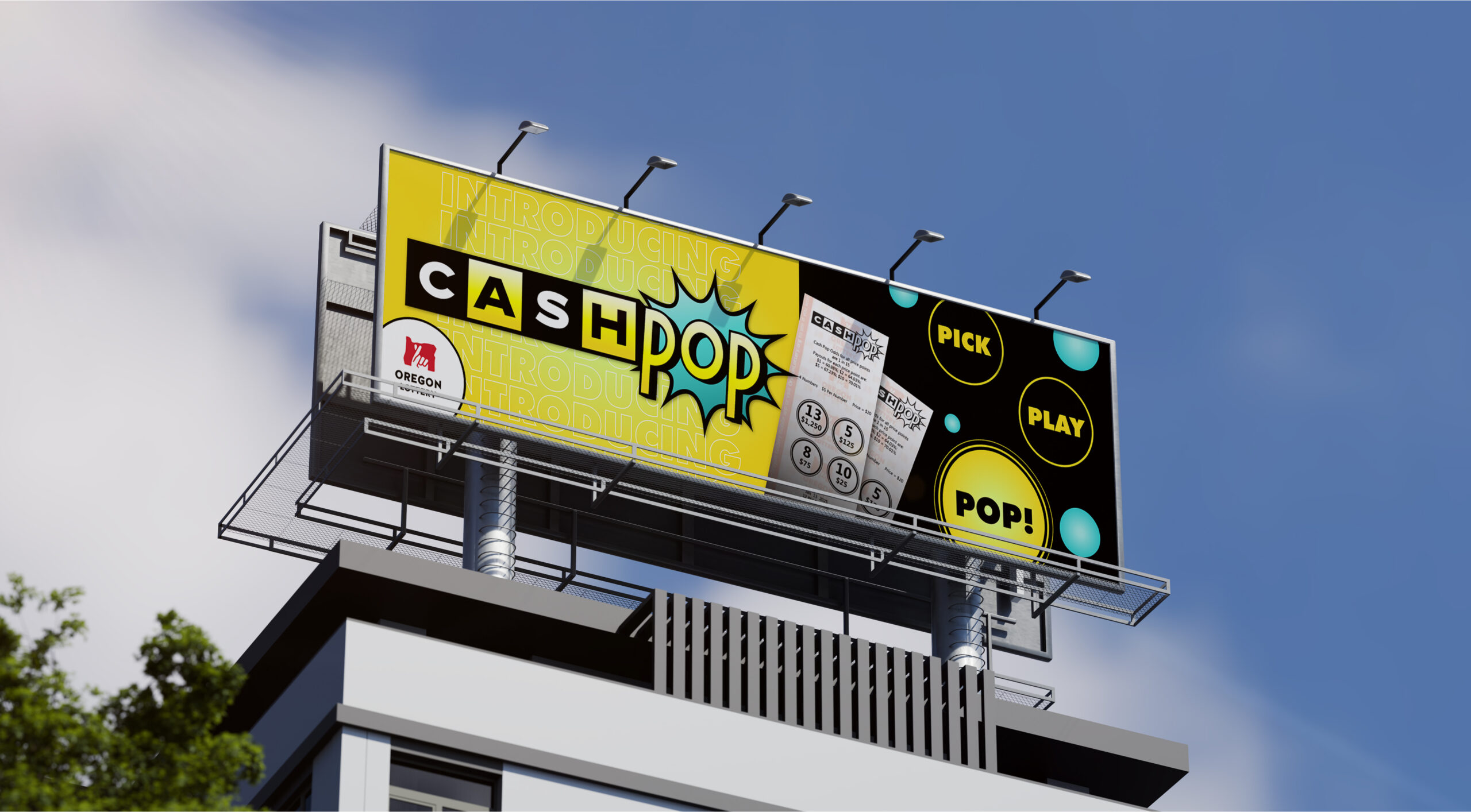
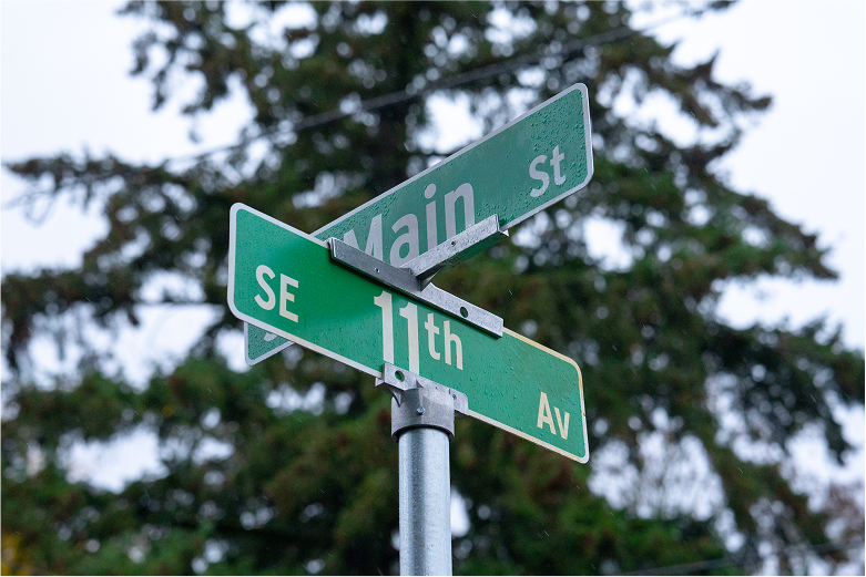
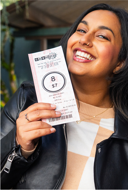
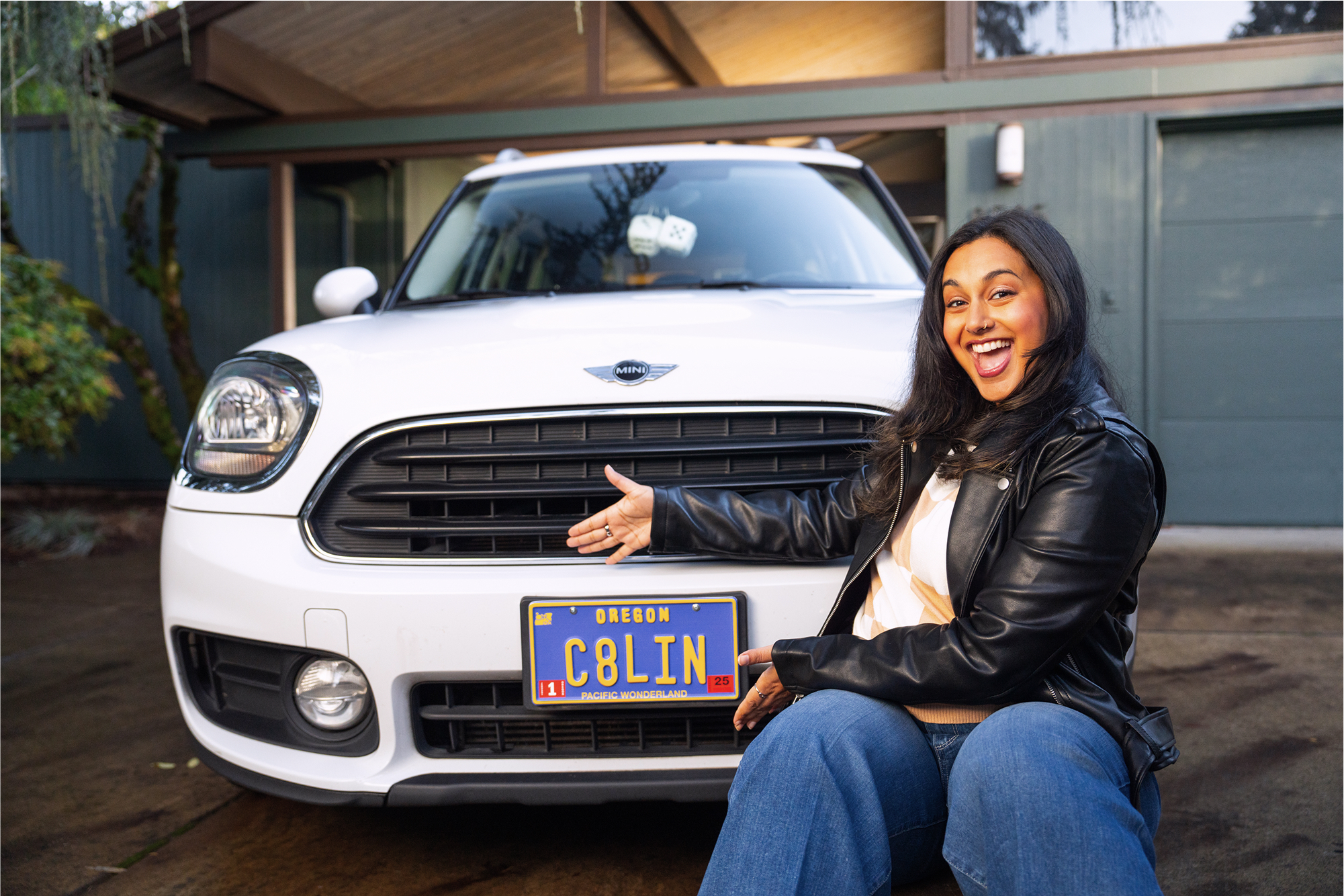
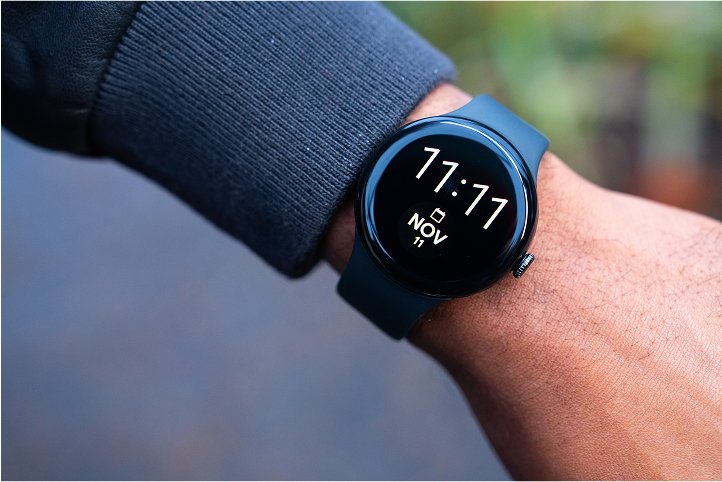
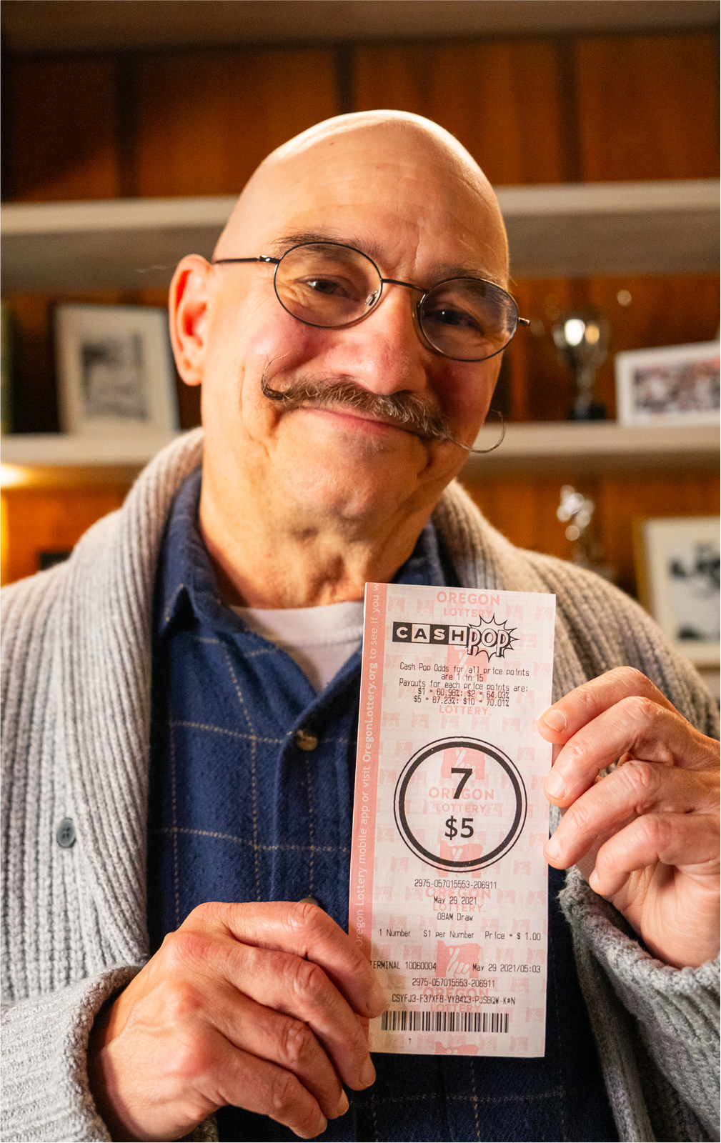
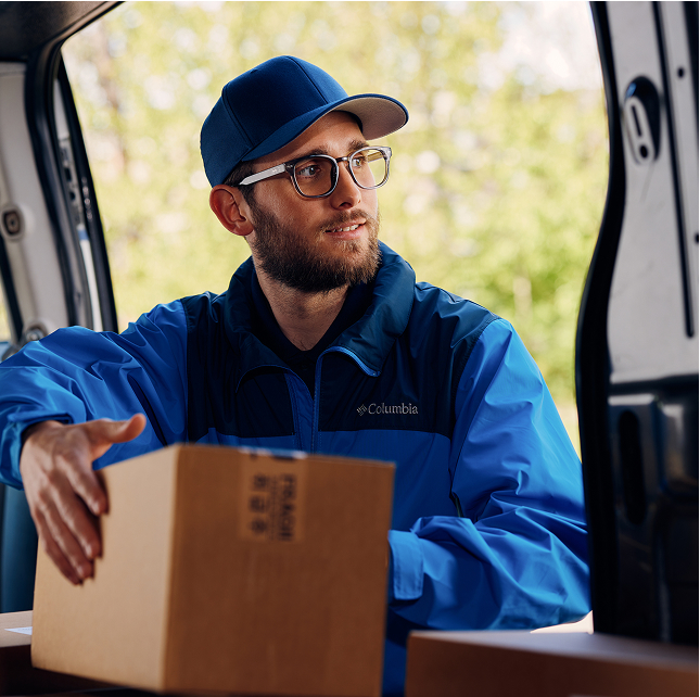
Oregon voters helped create the Oregon Lottery in 1984 as a way to help stimulate the economy and fund beneficiaries like State Parks and public schools. And for the first time in 15 years, Oregon Lottery was going to be launching a new game – Cash Pop!
Cash Pop needed a simple, exciting introduction to the state, and the Oregon Lottery wanted this launch to feel fresh while still fitting within the larger brand. The result? Compelling creative, a seamless digital experience, and a best-in-class media campaign leveraging historical brand knowledge and market expertise–all leading to one of the most successful launches in Oregon Lottery history.
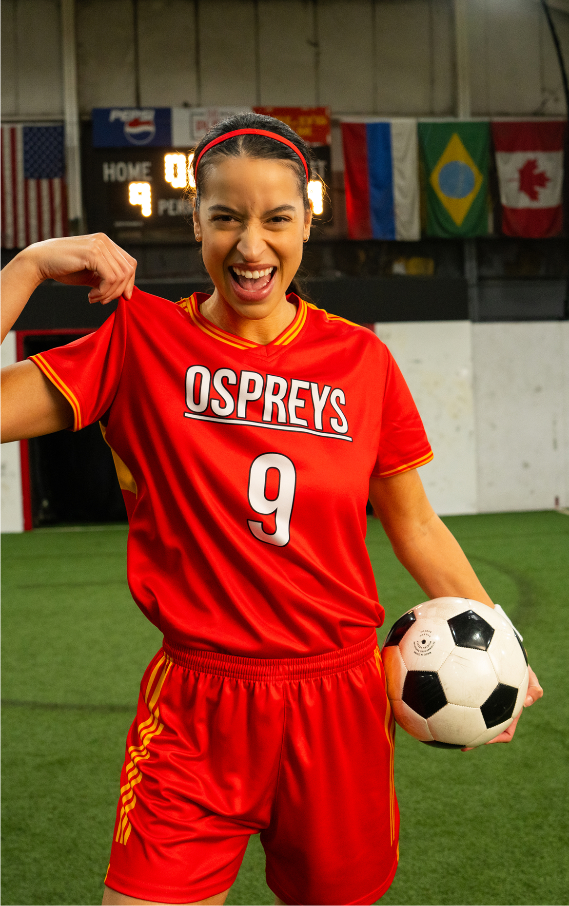
Our way in? Favorite numbers – because everyone has one. Playing Cash Pop, while seemingly complicated, could also be distilled into a simple directive that acknowledged the player’s agency: play YOUR favorite. We focused on upbeat pacing, tactile numbers, and a younger audience, with Cash Pop meeting Oregonians where they were. The result was a spot that felt new, exciting, and relatable – and won a Telly Award!
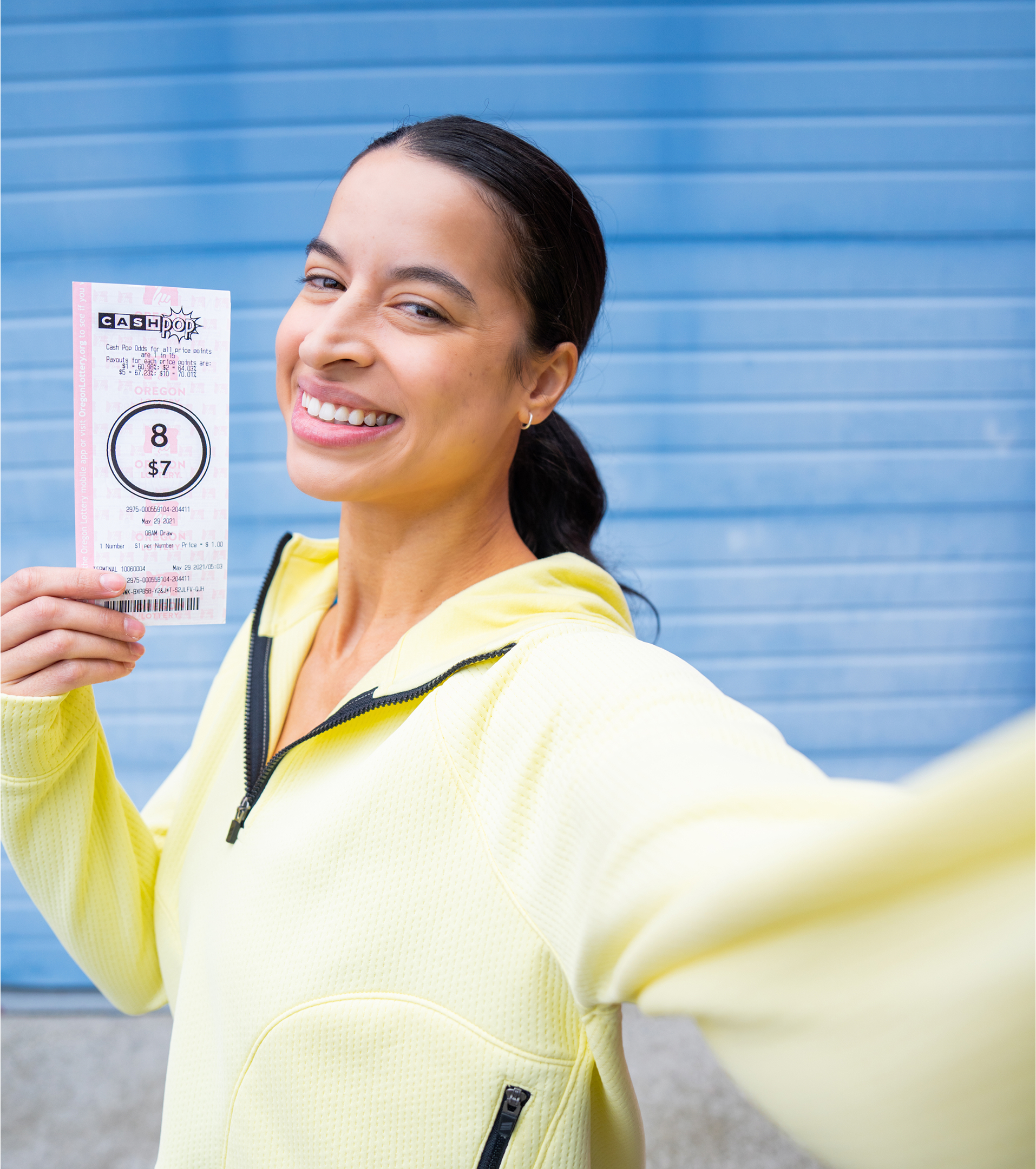
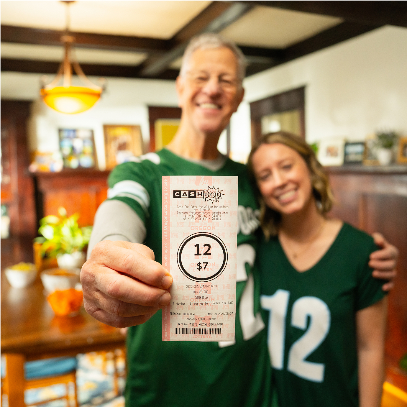
Cash Pop’s launch also required integration into the current oregonlottery.org website and mobile app–Oregonians needed a way to check the winning numbers for their new favorite game. Our development team built updates for both platforms, but tailored the content for each audience: the Landing page provides a game tutorial alongside recent draws, while the mobile app lets users scan their tickets to see if they won.
With a strategic combo of placements, our media team tackled two main goals: creating awareness and boosting conversion. While we pulsed traditional media tactics like billboards and broadcast ads to encourage trial during launch, digital efforts stayed continuous to reach Oregonians online. We also worked with local radio talent to create community connection and excitement, along with Oregon-based multicultural partners. The launch campaign won a Cascadia Creative Award for creative use of media.

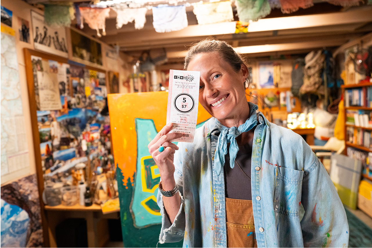
+567% increase
in average monthly revenue over previous product
One thing about having both your media and development teams in-house? Quick resolutions. On teaser launch day for Cash Pop, our media team alerted the development team that the client-created vanity URL wasn’t working as expected. Dev leapt into action and had a new link to the media team in minutes. Zero downtime. Zero bad clicks on ads. That’s the power of seamless communication.
First Tech Federal Credit Union | Brand Campaign
The credit union for people in tech.
Creative
Video
Media

First Tech Federal Credit Union was built for tech workers by tech workers, and their current brand strategy focused on meeting their clientele where they were at: work. However, in the wake of the Silicon Valley Bank collapse and industry-wide layoffs, their already risk-averse clientele was feeling wary of financial institutions. First Tech needed to be seen as as trustworthy and safe – a safe harbor in the storm.
The solve? An uplifting and empathetic campaign that would position First Tech as the only financial partner that truly understands the reality of the tech industry.
Our spots focused on showing the whole humanity of First Tech members – not only who they are at work, but as whole people capable of community (which is what credit unions are all about.)
During a massive 5-day photoshoot, we created a huge asset library the campaign could draw from. These assets covered not only general brand, but specific products like personal savings and credit cards, plus individual First Tech members (each with their own backstory) at and beyond their workplaces.


Since the industry was craving consistency at this time, we didn’t completely reinvent First Tech’s brand look. Instead, we evolved it – updating existing elements like the speech bubble to feel more tech-endemic, introducing gradients, and focusing on the emotional experience of First Tech members.

Media efforts focused on increasing awareness and building brand recognition to keep First Tech at top of mind. Overall, CTRs and time on site were well above industry benchmarks, and results only got more positive after midway optimizations. While not directly attributable, brand awareness media often leads to an increase in organic search volume – and during this campaign, new users visiting the site via organic search increased by 26%, pages per session increased by 6%, and average session duration increased by 4%, compared to the previous period.

Oregon Lottery | Seasonal Campaign
‘Tis the season
for Scratch-its
Creative
Dev
Video
Media
Branding
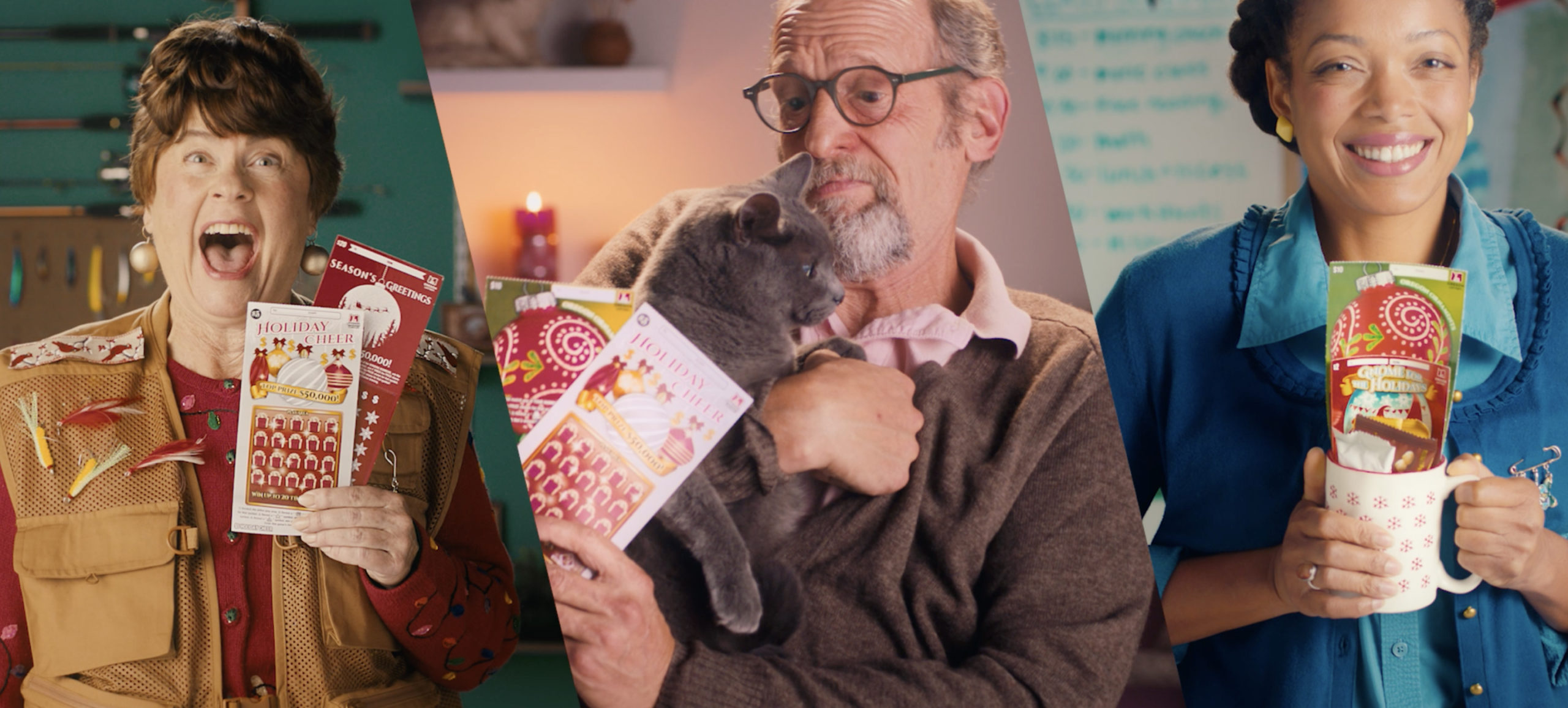
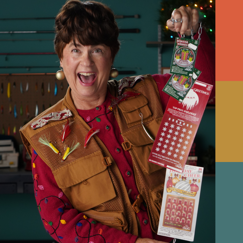
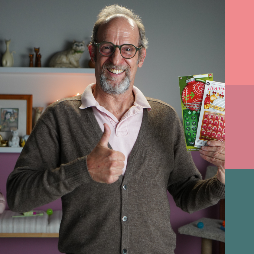
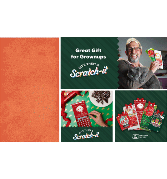
Scratch-it tickets are Oregon Lottery’s holiday hit—so we created a product campaign as familiar, exciting, and fun as opening a gift on Christmas morning. We focused on the folks who are a big question mark on your holiday gift list. The answer? Everybody loves a Scratch-it, even your weird neighbor!
Our wordmark needed to give warm and fuzzy feelings, without immediately invoking a specific holiday. So we focused on a joyful font and rich, bright tones that eventually ended up influencing the sets in our commercials.
Art Direction
We had a lot of characters to introduce in a short amount of time. Each imagined Scratch-it recipient was paired with a color-coordinated set rich in textures, populated by holiday items specific to their personality. Peep the cat portrait produced by our very own art department.

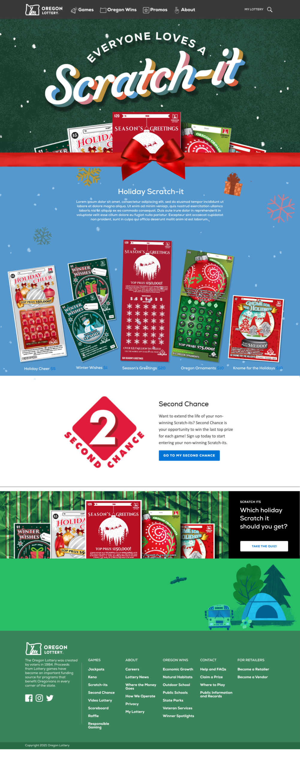
Big holiday spending means a big holiday media campaign. Across a strategic mix of traditional and digital media channels, we served 42+ million impressions and YOY helped increase Scratch-its interest with younger consumers.
Wisdom Panel | Soul Mutt Campaign
Why do we love dogs?
Creative
Media
Video
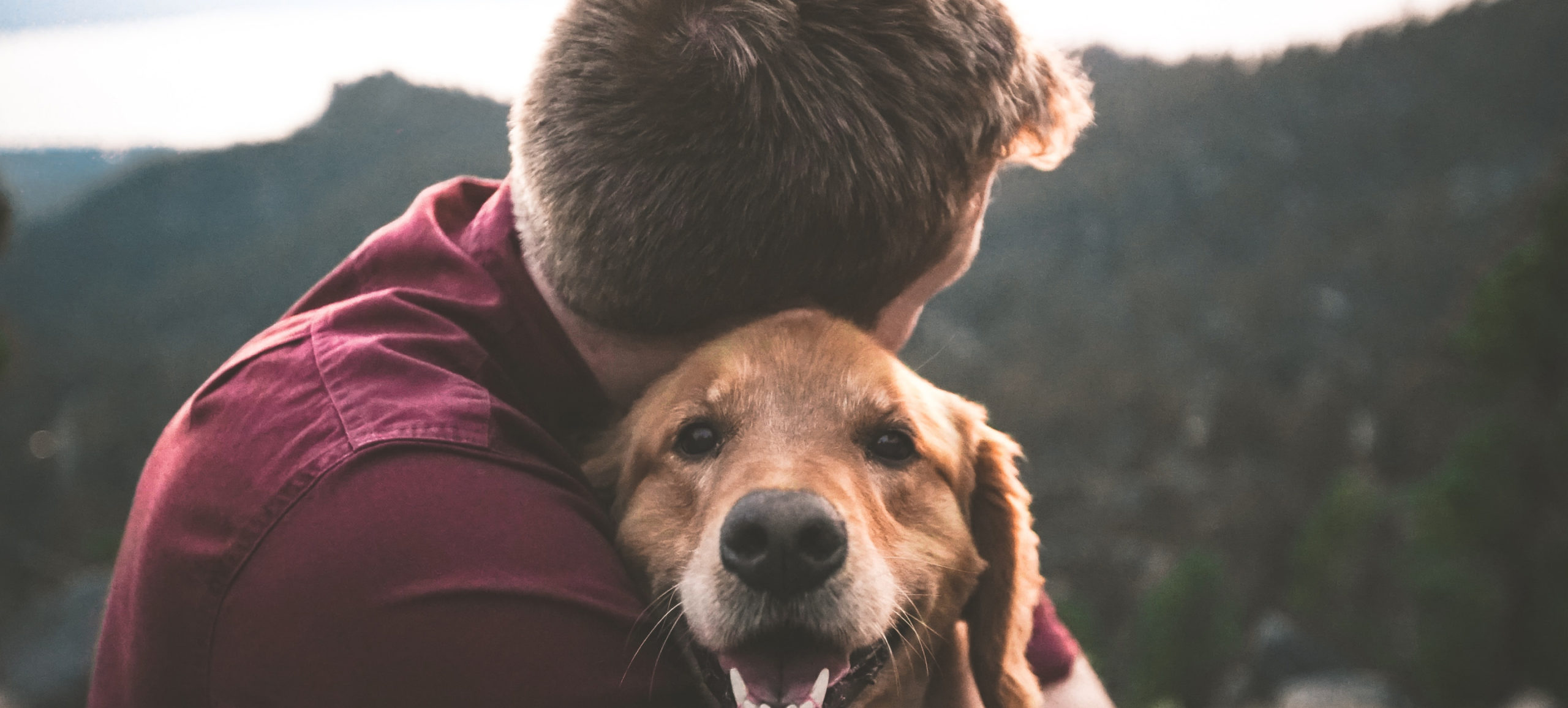
Ever wonder about your dog’s specific personality quirks? For example…why is my labrador retriever terrified of getting in the water? Great question. Wisdom Panel exists to answer these kinds of quandaries, with at-home DNA kits that reveal your dog’s genetic makeup, and help you better understand your dog. We were approached to raise awareness about the benefits of Dog DNA testing, along with push conversion with a fresh digital and social campaign that celebrates Wisdom Panel’s updated branding and messaging.
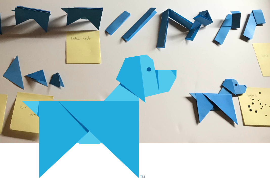
First priorities were a fresh brand awareness spot, and an engaging how-to. Taking note of their logo styling, we knew we had to make this tactile. So we partnered with David Emmitt to transform these spots into paper-folding stop motion animations.
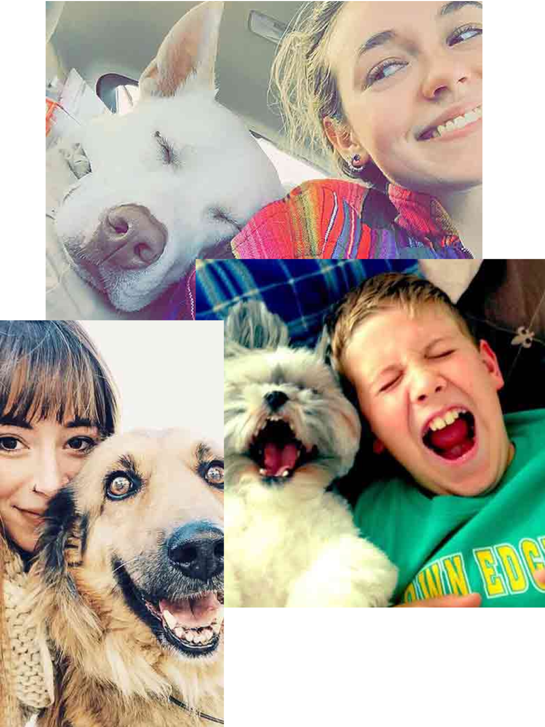
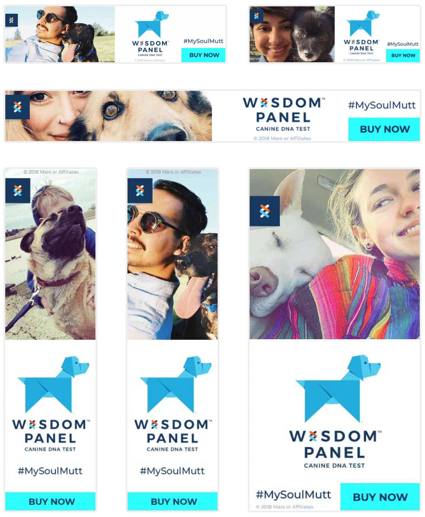
The best way to capture the authentic connection was with User generated Content. Pollinate worked with Wisdom Panel to email their CRM database, asking for users to submit photos on Instagram with the hashtag #MySoulMutt. The result? An asset library grounded in authenticity.
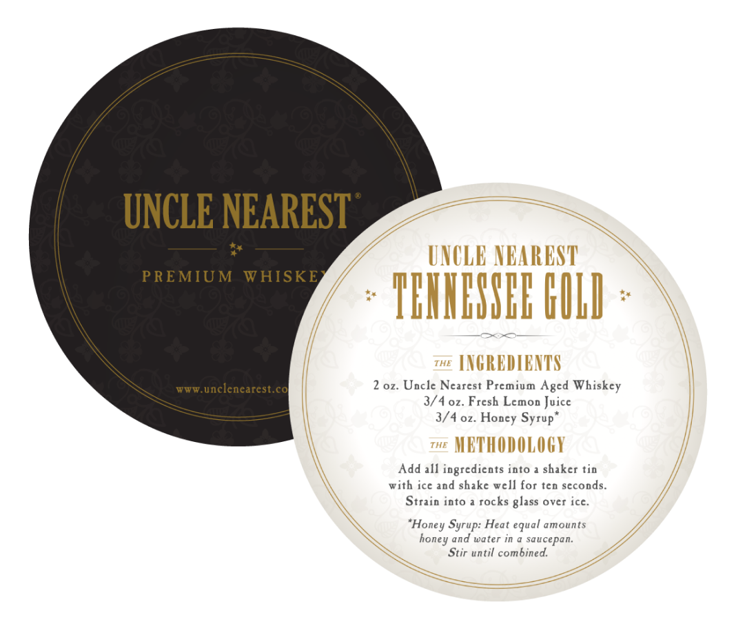
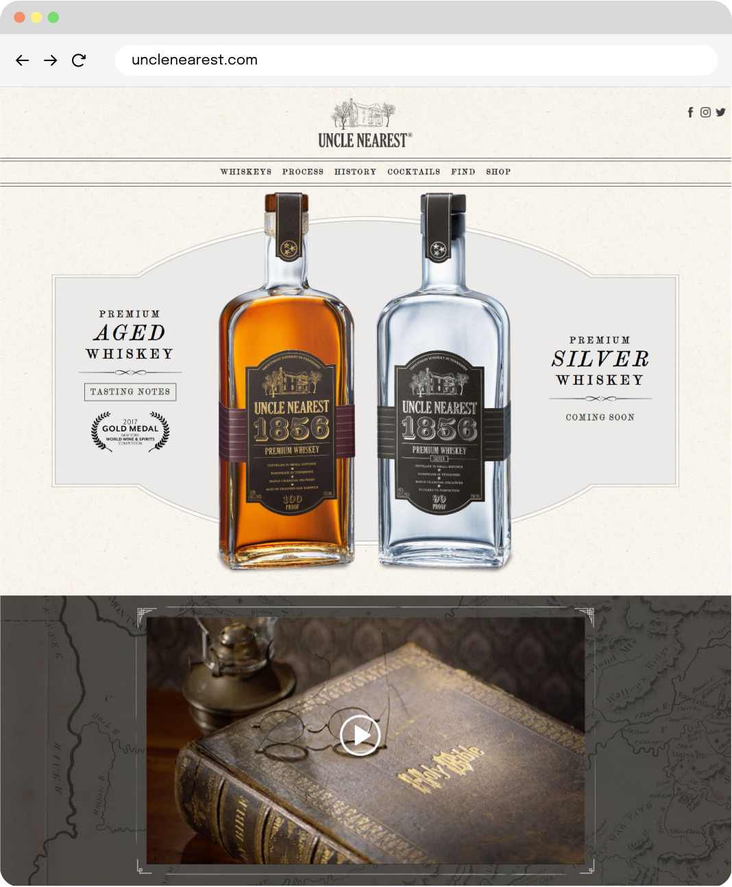
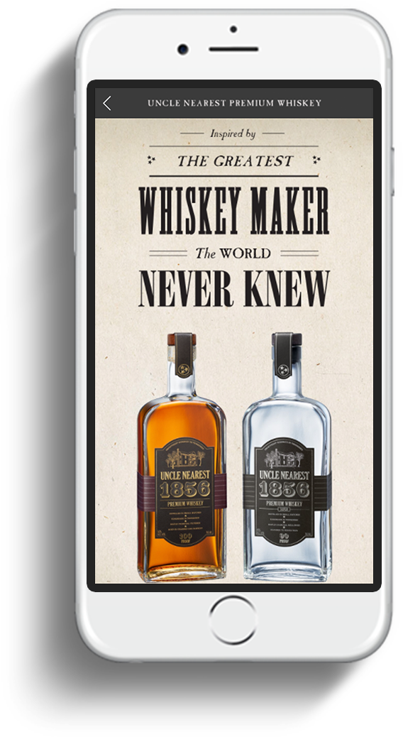
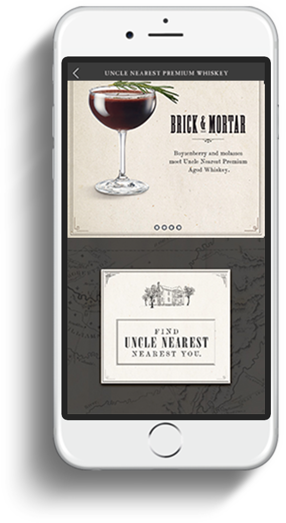
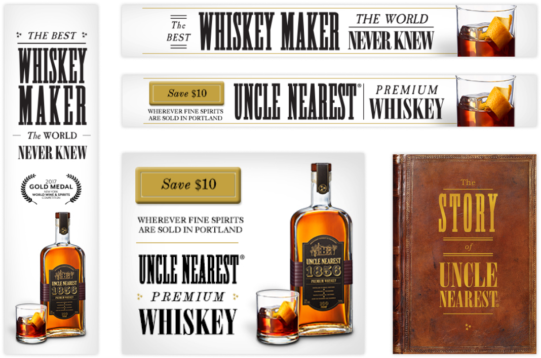
Uncle Nearest | Brand Launch Campaign
A legacy, served neat.
Creative
Dev
Digital
Media
Video
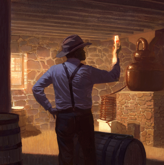
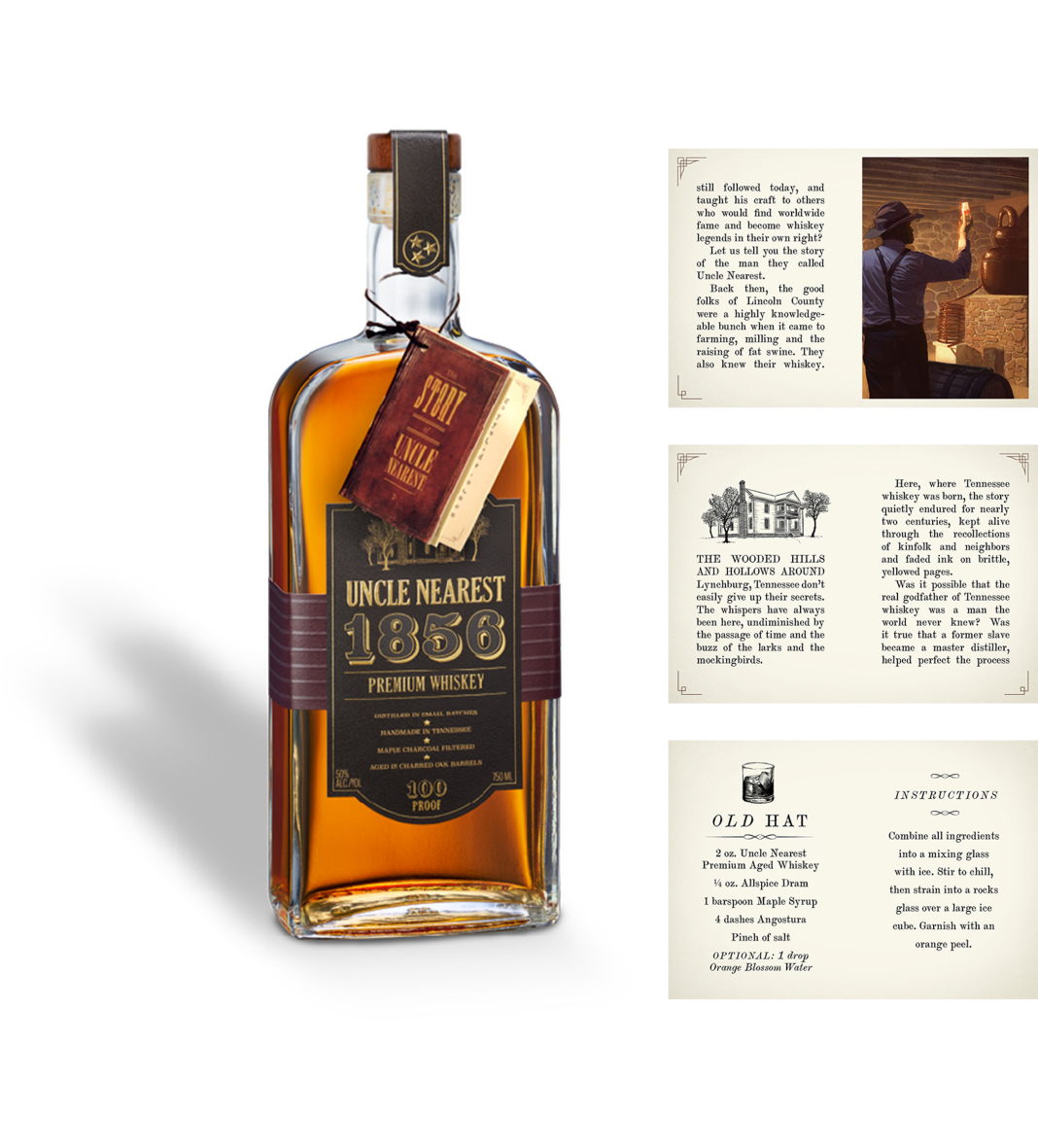
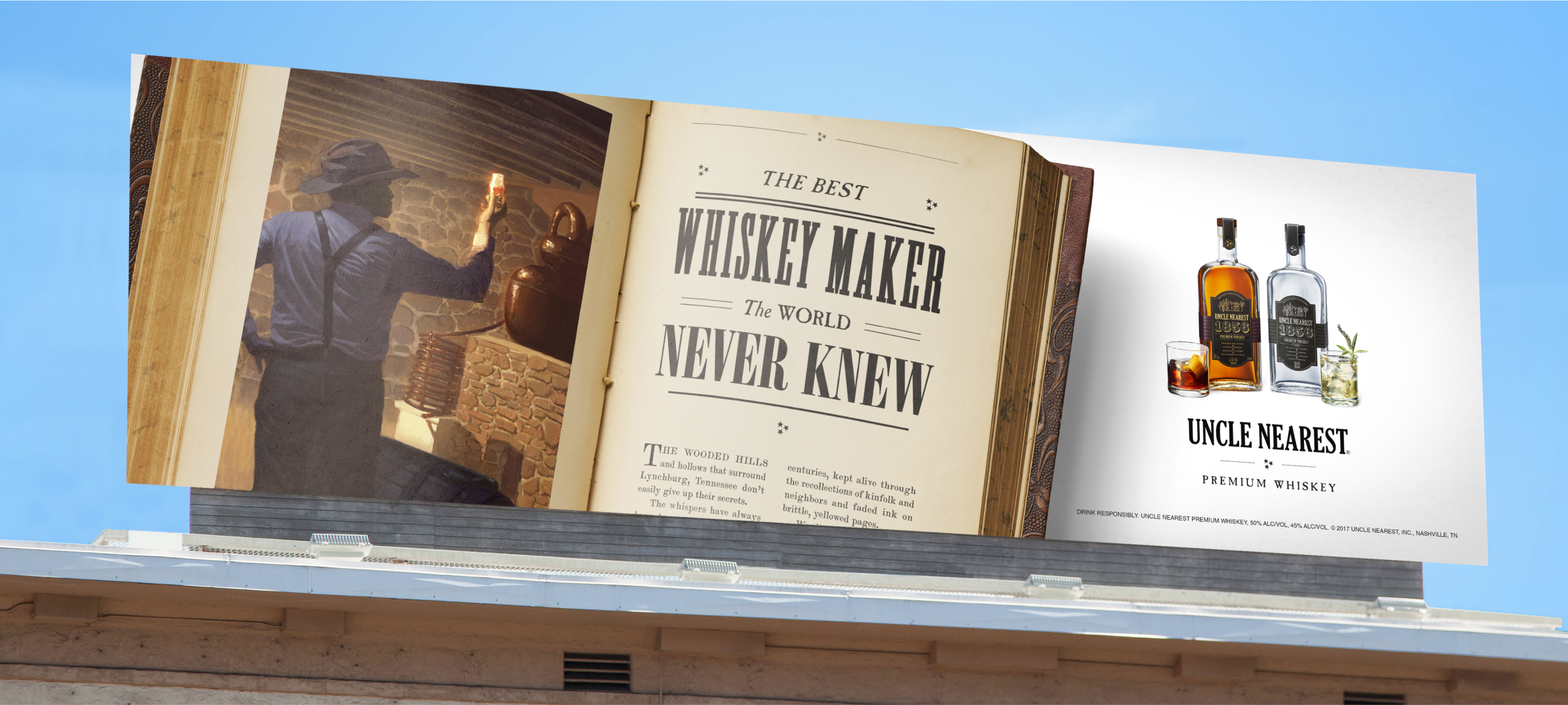
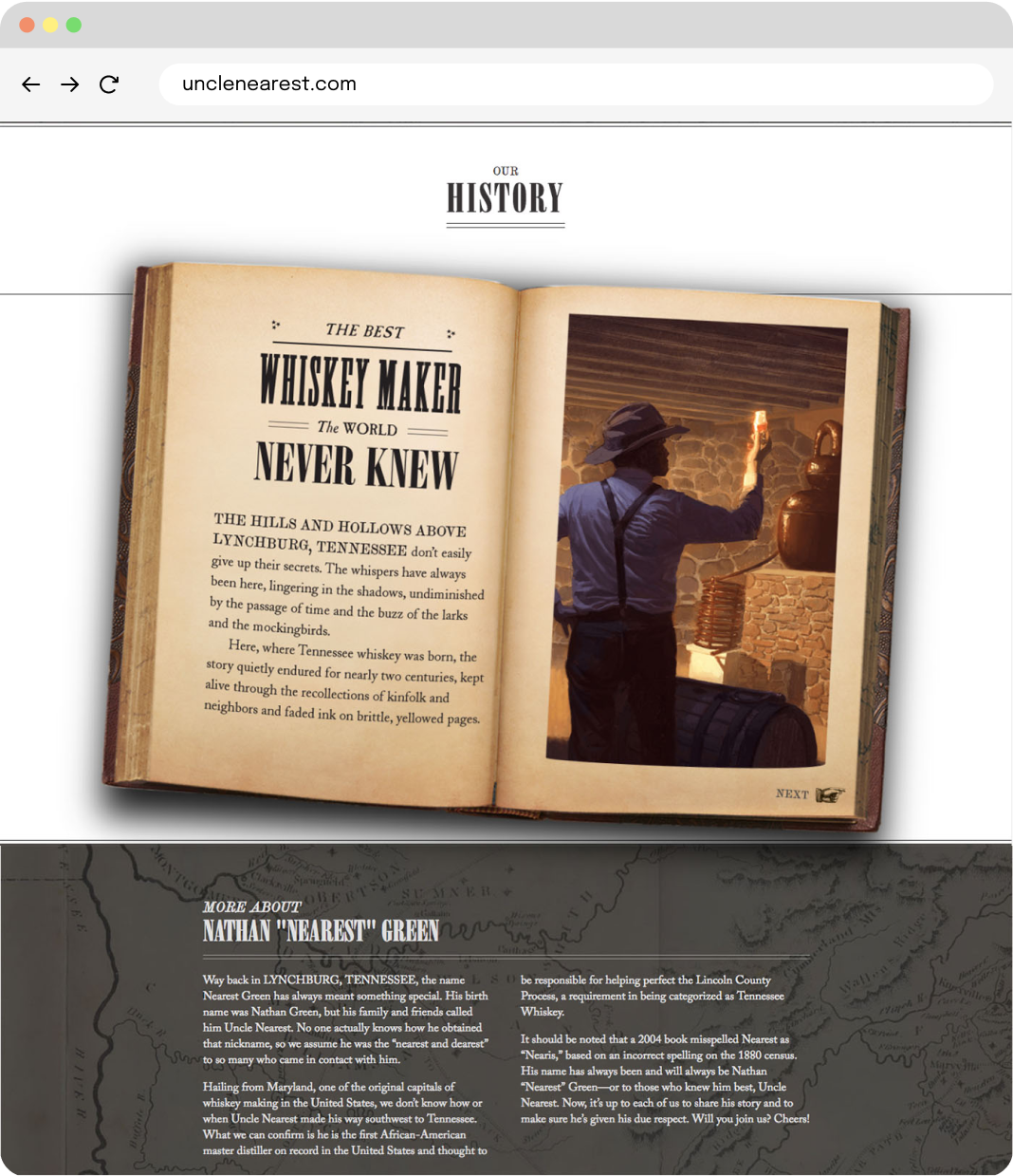
Hidden deep within the hills above Lynchburg, Tennessee, was a story waiting to be told — and a whiskey to be discovered.
When Uncle Nearest premium whiskey approached Pollinate, asking if we could deliver a launch campaign defining its unique position in the land of distinctive high-end whiskeys … well, there was no way we could say no. The story was and is riveting, and with one taste, you knew: the whiskey had legs. Award-winning legs.
In a category where drinkers value authenticity, we launched this ultra-premium brand in a way that was true to the man, his incredible story — and his legendary whiskey-making skills.
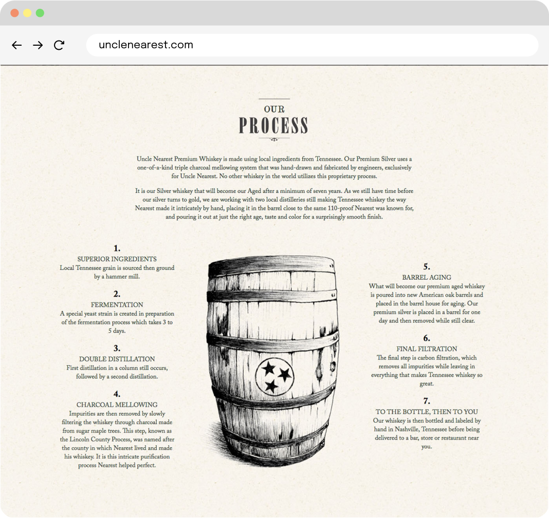
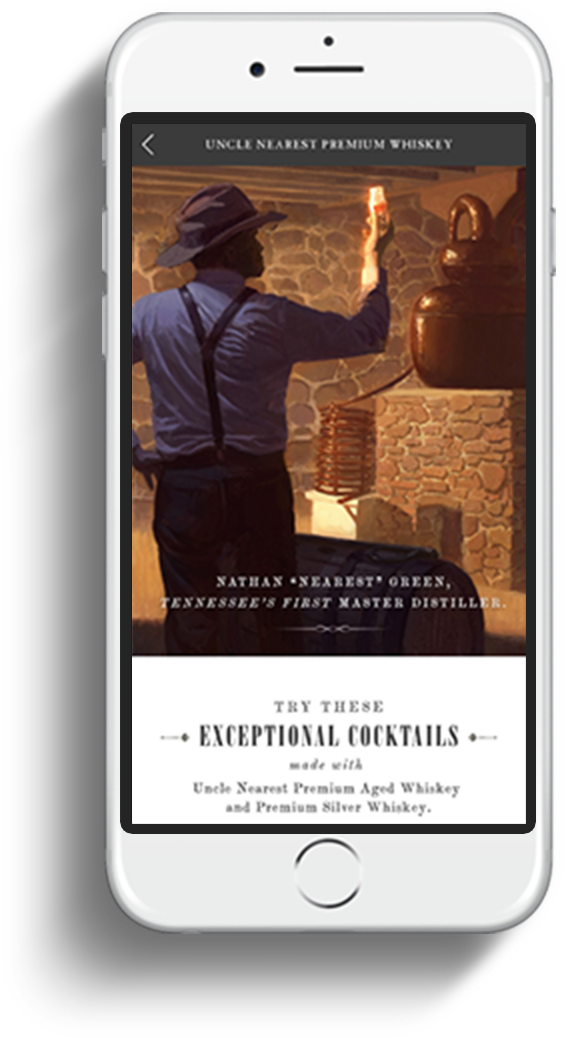
After more than 150 years, it came to light that a formerly enslaved man named Nathan “Nearest” Green was the first master distiller for a certain local whiskey salesman whose name we can’t use. (Hint: It rhymes with Zack Janiel’s.) Uncle Nearest, as he was known, is believed to have perfected the charcoal-filtering process and many of the techniques still followed today.
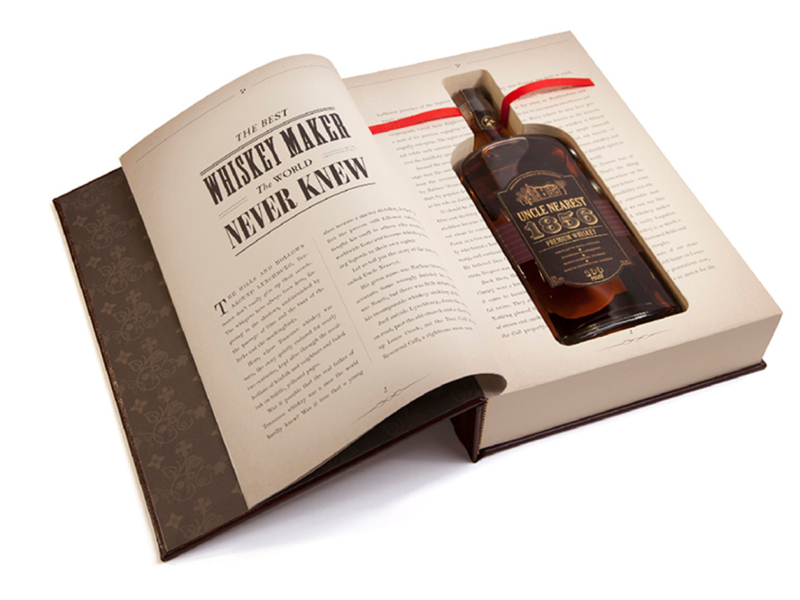
One for the books
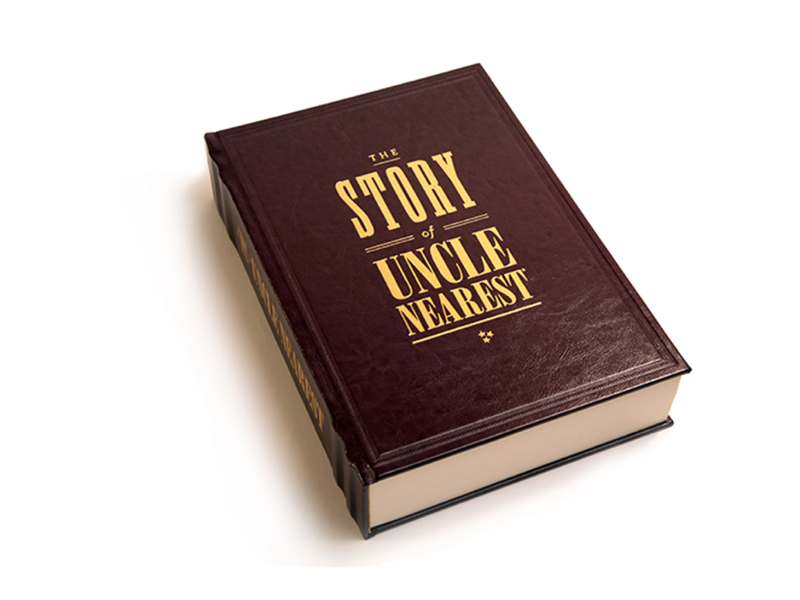
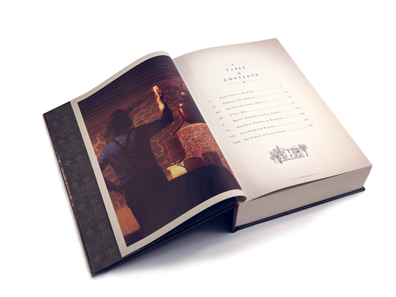
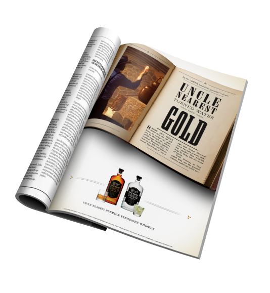
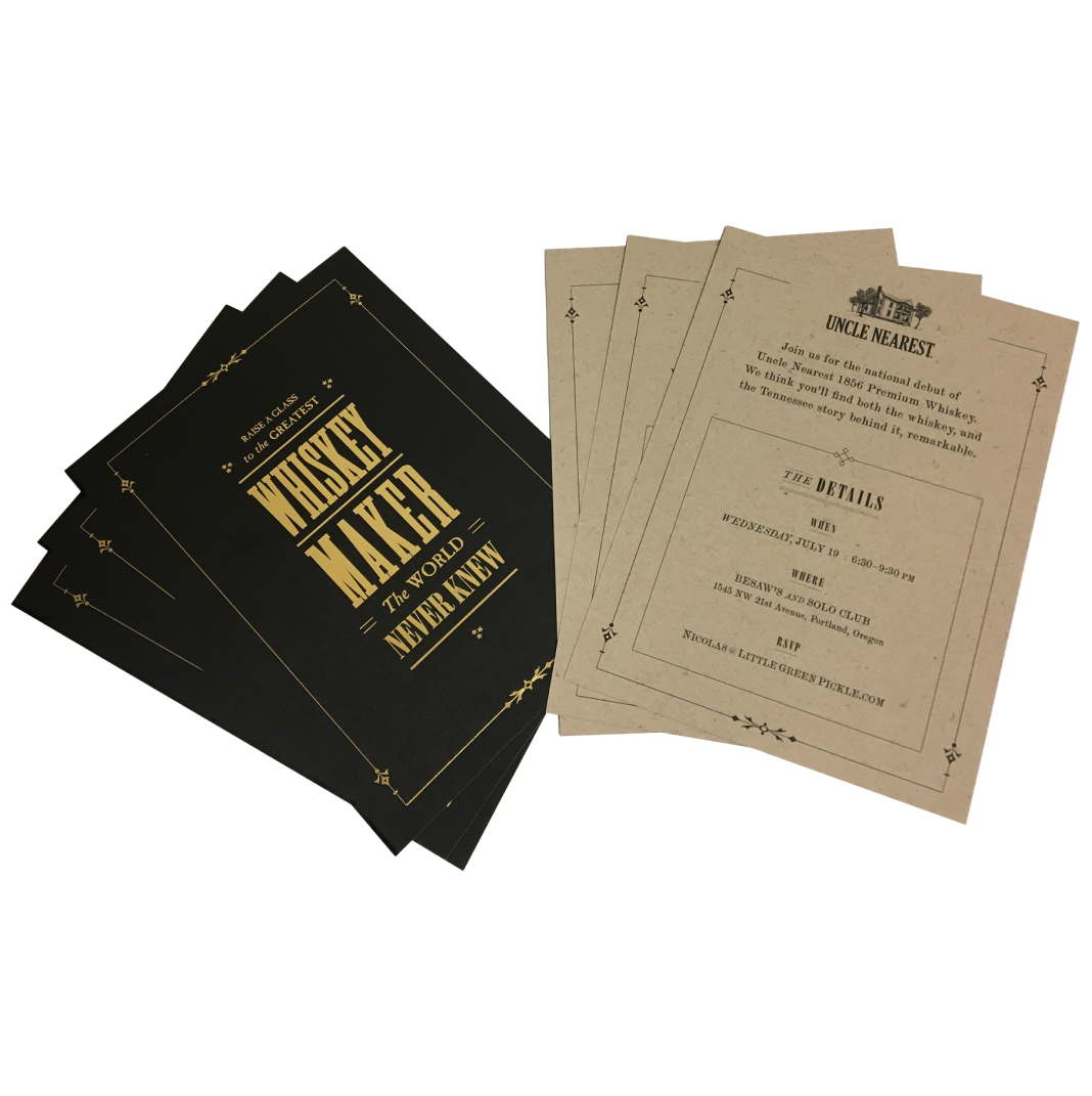
Step one: a launch strategy. And that was simple: With an irreplaceable spot in history, Uncle Nearest’s story needed to be told. So, we wrote a limited-edition book, which then became the thread tying all of the deliverables together, with the first edition ending up where it belongs: in the Smithsonian.
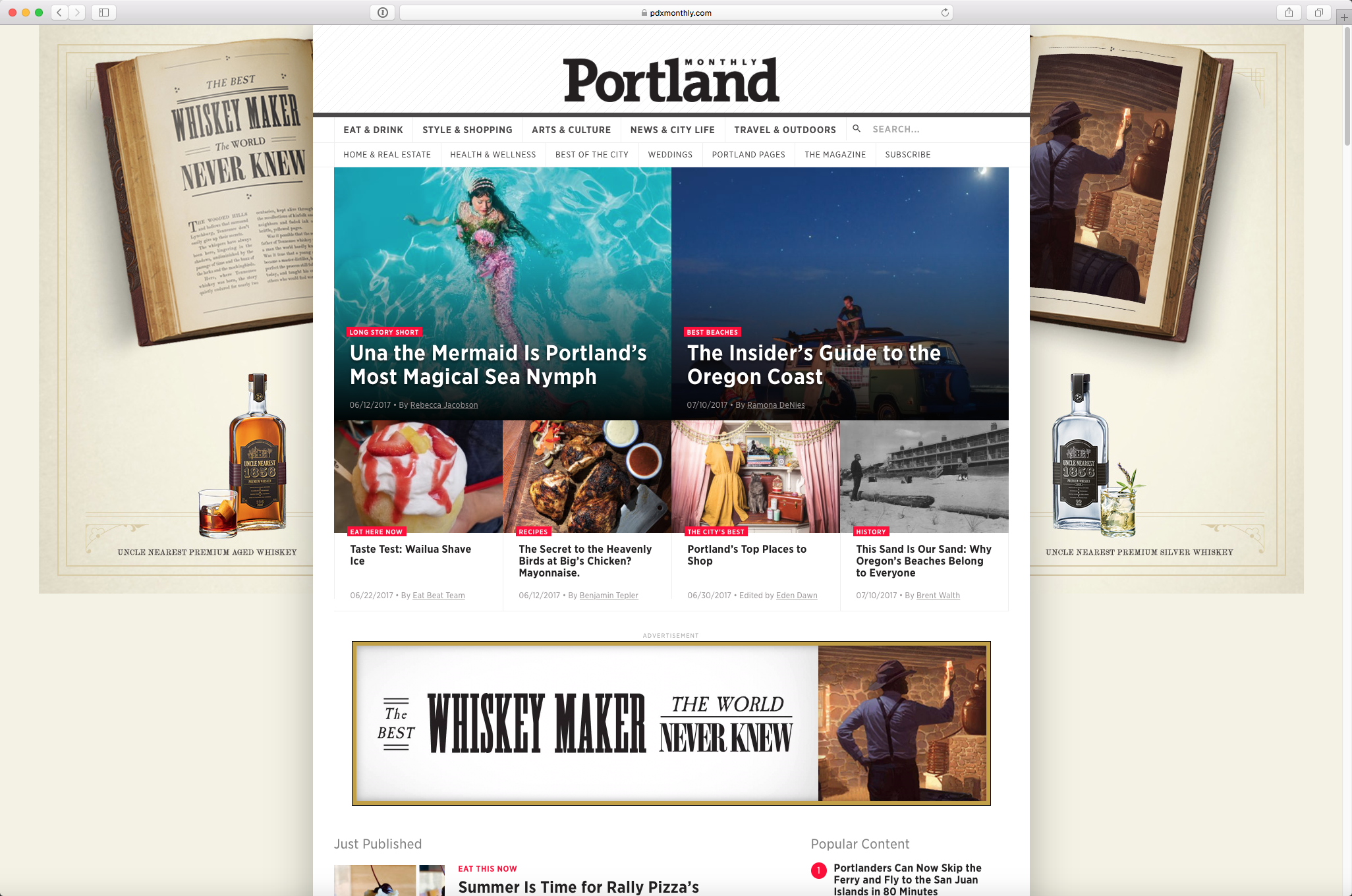
For our media approach, we focused on raising awareness in key markets (Louisville, Chattanooga, Memphis, Knoxville, Portland, and Nashville) to drive product demand with our core audience and spur sales at liquor stores, bars, and restaurants.
38.4m
impressions
177.5k
site visitors across all markets
34%
increase in site visitors
First Tech Federal Credit Union | Student Loan Refi Campaign
A fresh look at student debt.
Creative
Video
Media
Dev
We get why student loans aren’t fun to think about—the phrase ‘repayment’ sends a shiver down the spine of anyone who has them. So it makes sense that most people don’t want to think about refinancing those loans, even if it’ll save them money in the long run. When First Tech Federal Credit Union tasked Pollinate with creating an engaging campaign for their student loan refinancing, we met the challenge by focusing on the expert help and repayment flexibility First Tech offers and, with our in-house production team, created two highly memorable (and humorous) spots.
Trust the experts.
Refinancing is a major decision that benefits greatly from professional advice. For this year’s campaign, we drew memorable comparisons to other decisions that are best left to the experts.
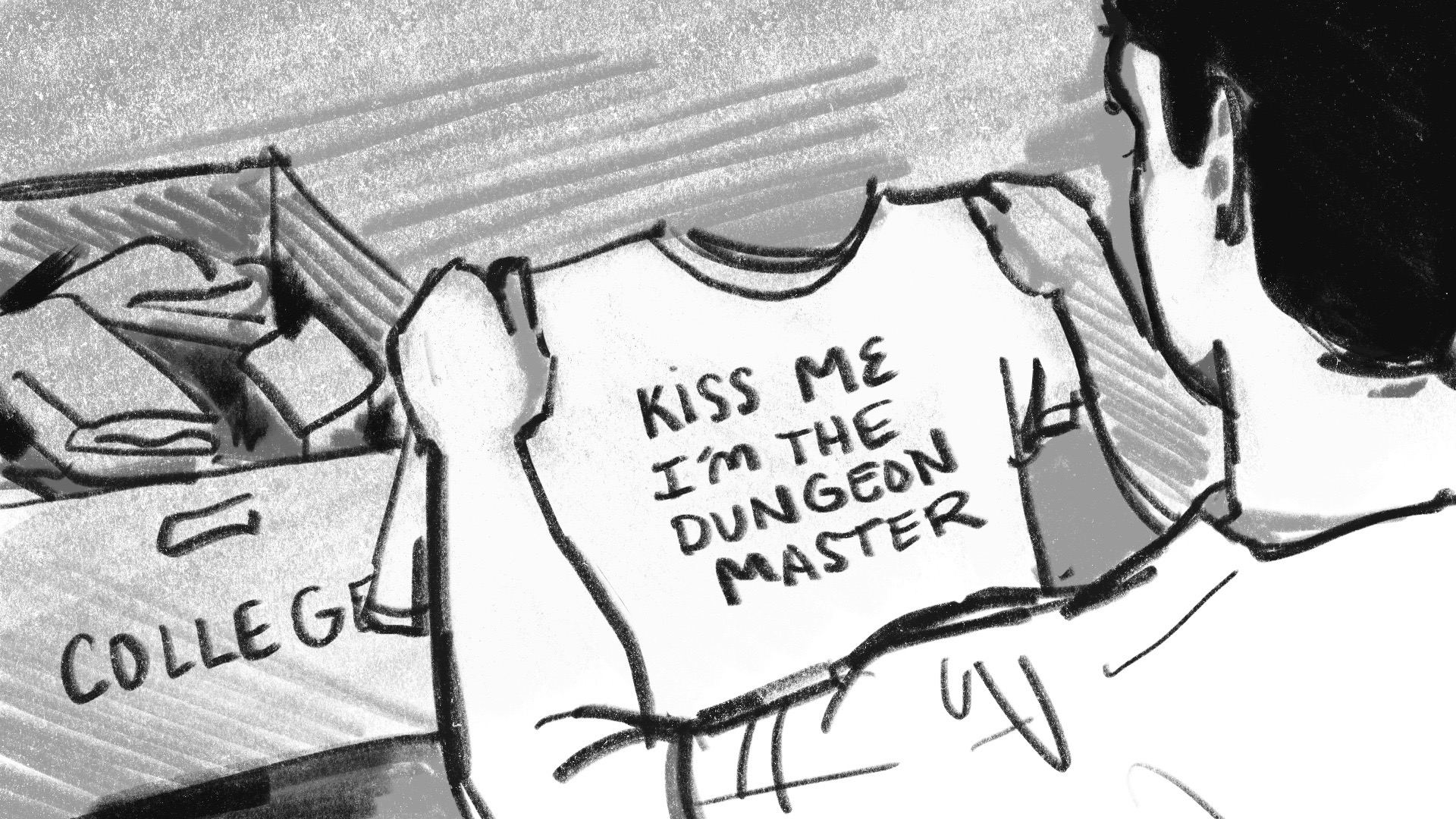
Some things are better left in the past.
All borrowers can relate with outgrowing who they were in college–cringing at what we wore, the music we liked, and the hairstyles we had. For this year’s concept, we highlighted another thing to cringe at: the rates you were given then, versus the rates you could have now.

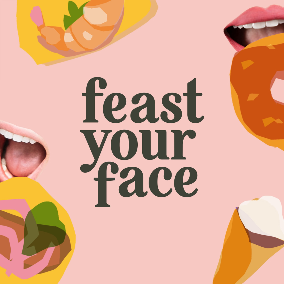
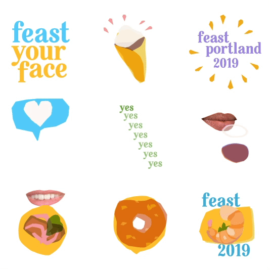
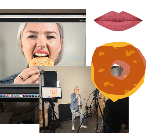
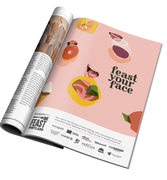
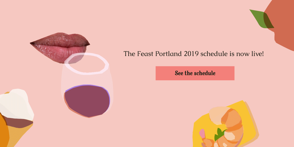
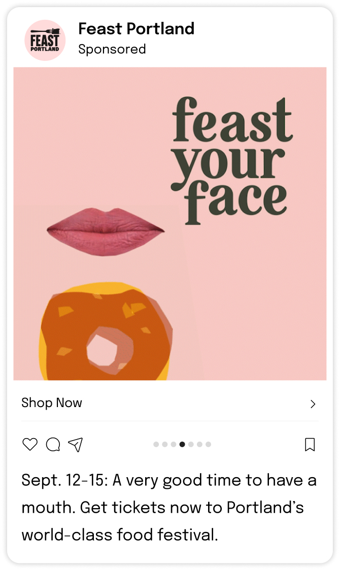
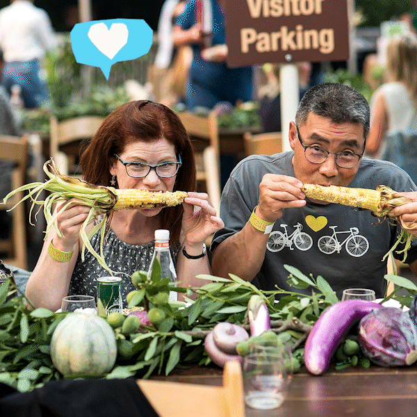
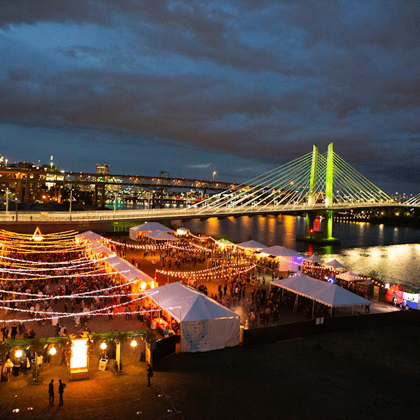
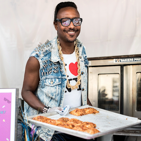
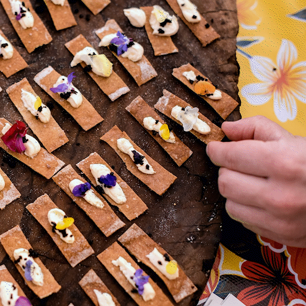
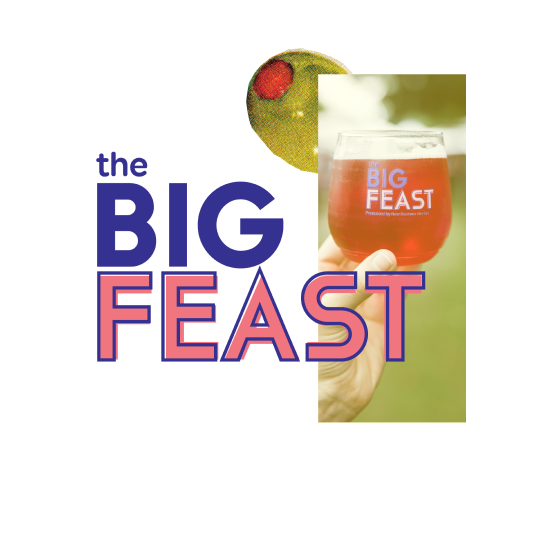
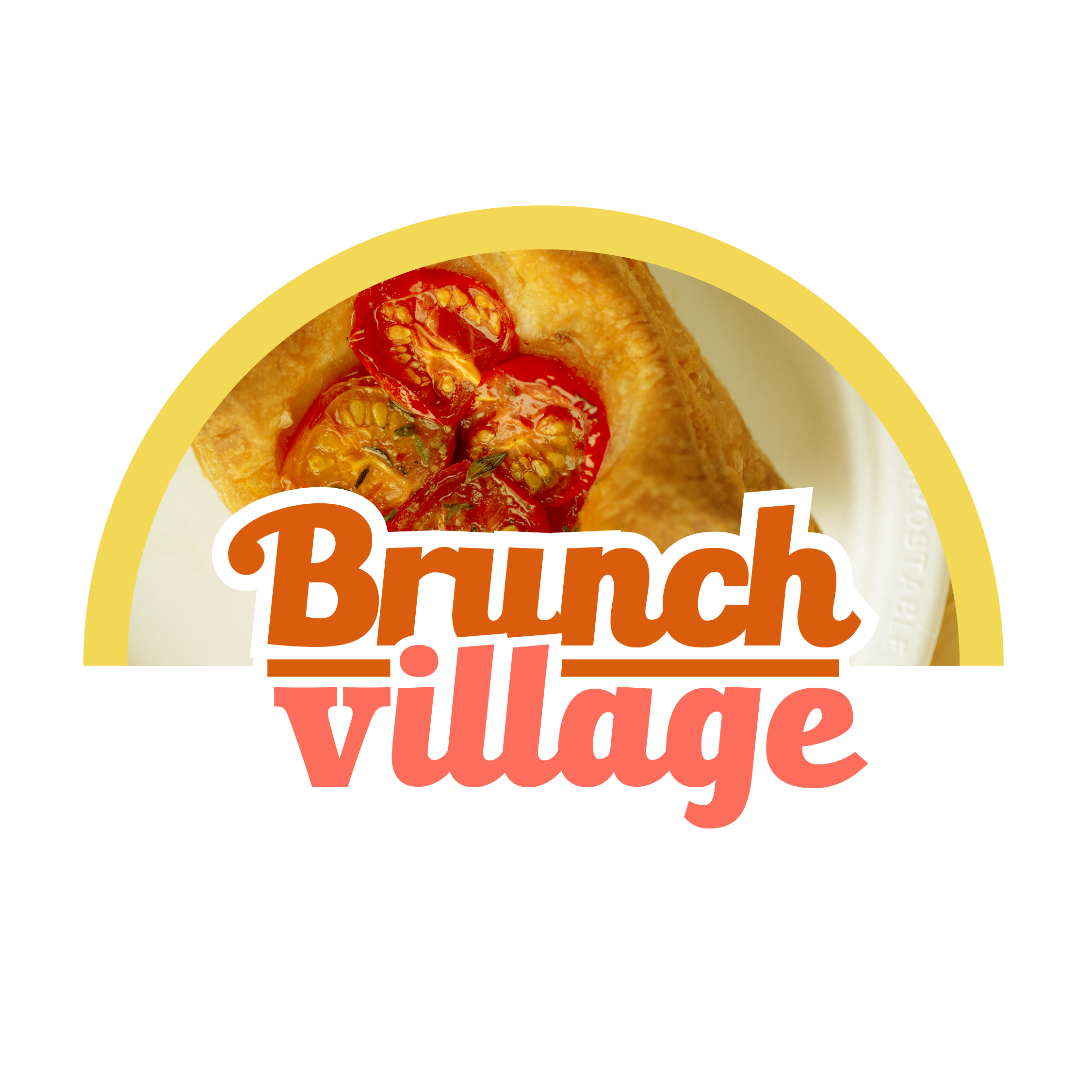
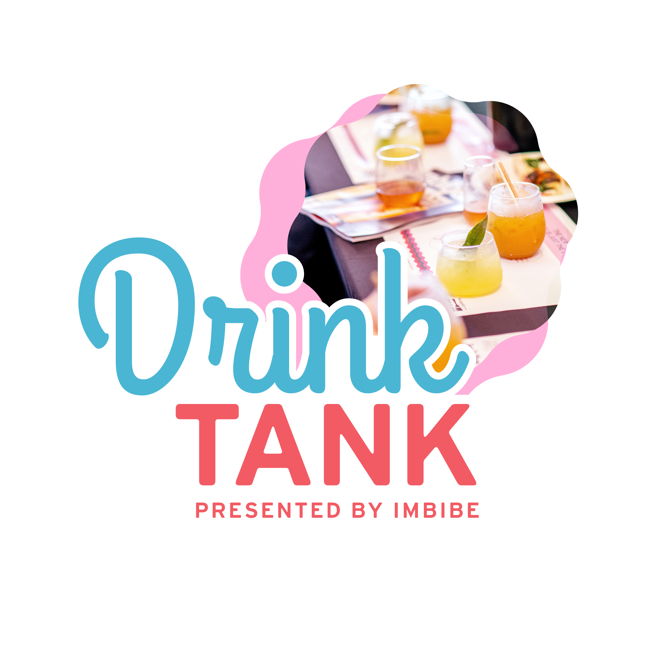
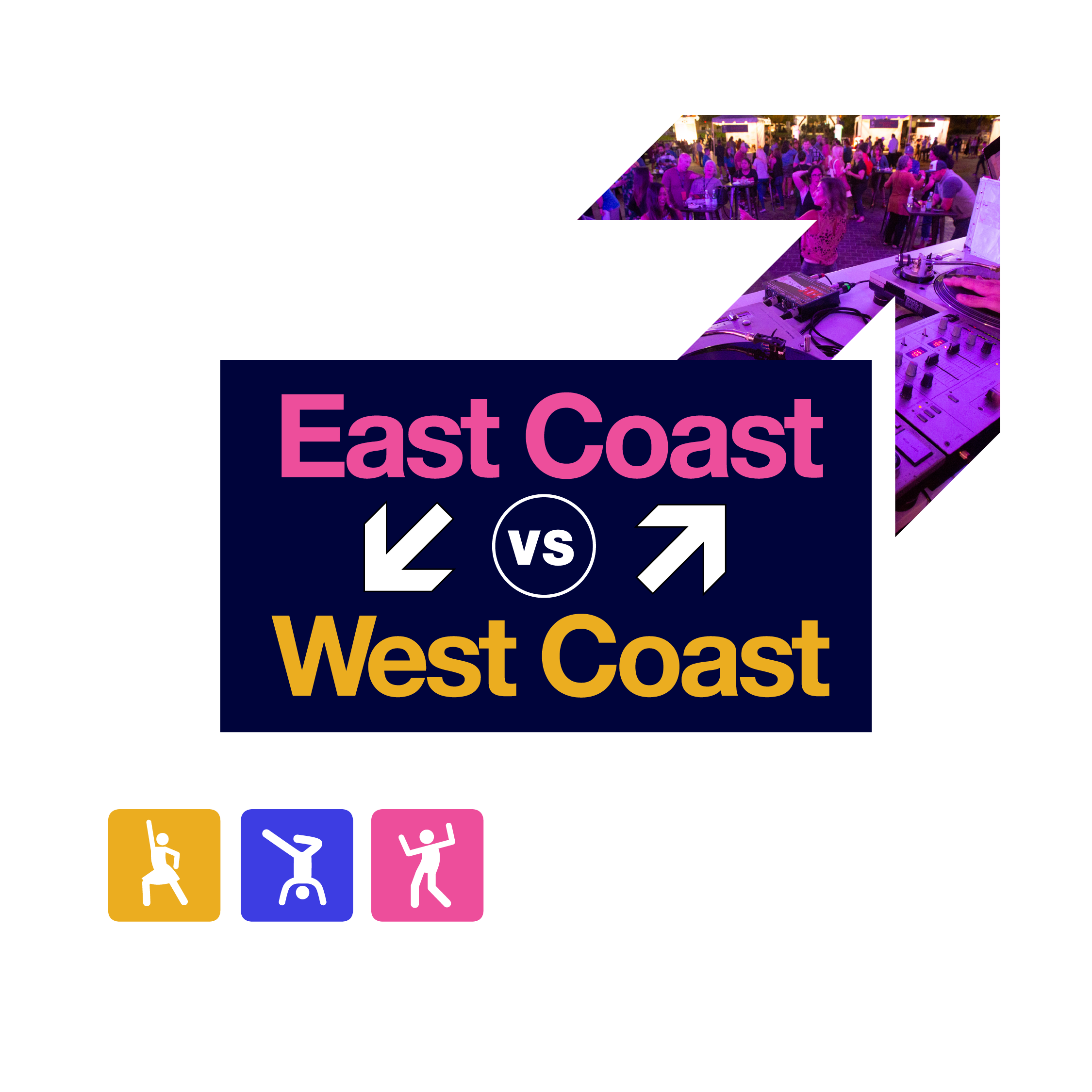
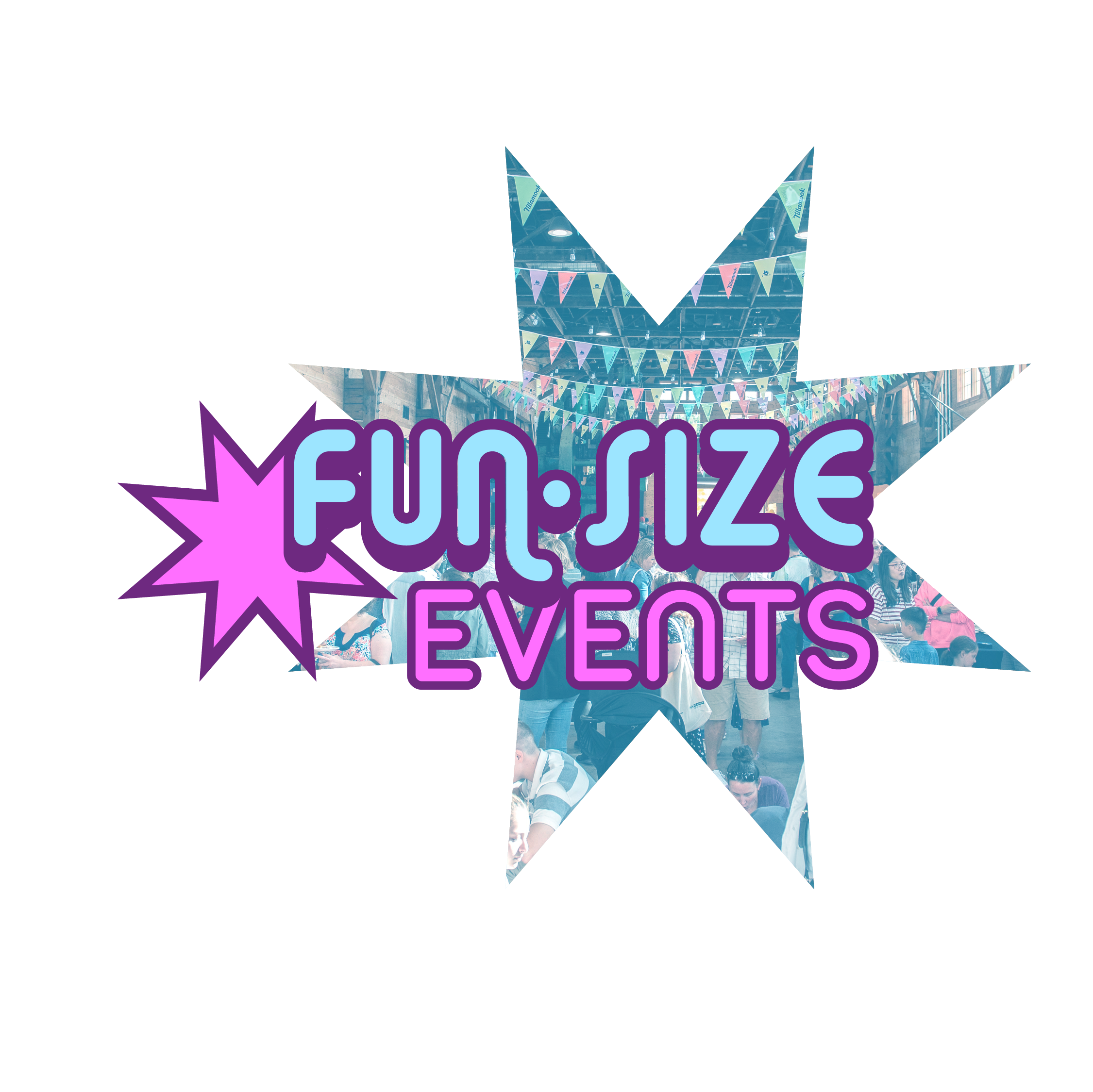
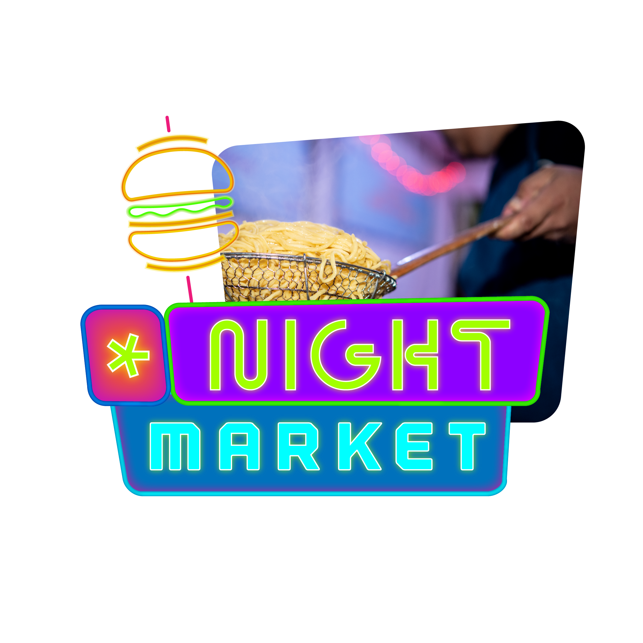
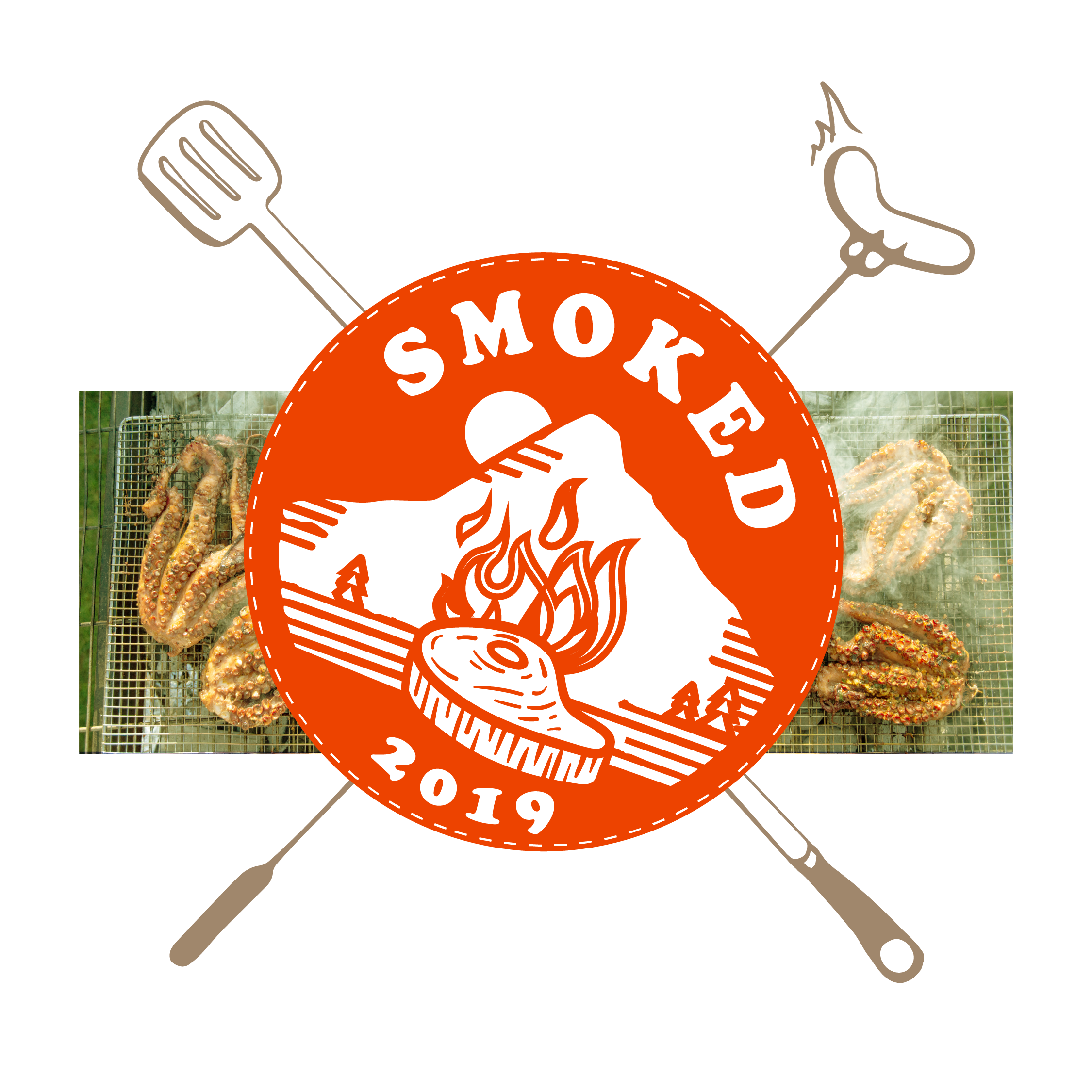
Feast Portland | Event Launch Campaign
Peak foodie content.
Creative
Media
Branding
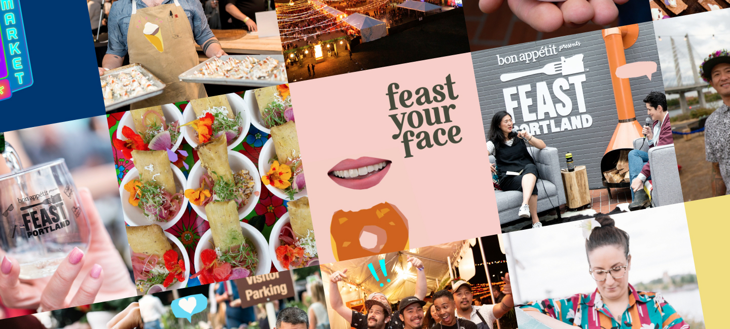
What do you do when you’re in the seventh year of being the agency of record for the country’s biggest foodie event? You bring in a fresh viewpoint — especially since this was the festival’s largest and most ambitious to date. Feast’s popularity and differentiation was grounded in its iconic locale – incredibly fresh and innovative fine dining paired with Portland’s vibrant eccentricity.
With “Feast your Face,” Pollinate brought in a warm color palette and understated typography juxtaposed with layered food illustration and quirky collage elements. This became a creative toolkit that drove visual identity across placements.
With social activation at top of mind, we developed a system of vibrant, playful illustrations and collage elements that serve as the visual anchor of this year’s look and feel across all touchpoints, but most notably: Giphy stickers for Instagram stories (search feast2019 under stickers to use them yourself).

Unique to the Feast brand identity is a series of events that are rebranded and updated yearly. Pollinate has always been at the center of creating these identities — applying color treatments, font selections and a set of original icons for each event, along with a brand guide for each event.
“If your site goes down on ticket launch day, you can punch me in the face.”
Ben Waldron
Our dev team created a proprietary plug-in that decoupled the front-end from WordPress, so that the site could be hosted in the cloud to handle large amounts of traffic – like the kind that happens when tickets go on sale for an internationally beloved food event. The site experienced its highest volume of visitors in the first 5 minutes, and sold out in a record 1.5 hours. The site did not go down. And Ben’s face remains as beautiful as ever.
Paid media placements contributed to a +424% campaign ROI. During the campaign flight, on-site metrics increased YOY, including an increase in users, time on site and pages per session. 1.52% overall campaign CTR 9-3x above the industry benchmark).
+424%
campaign ROI
1.52%
overall campaign CTR
3x
above industry standard
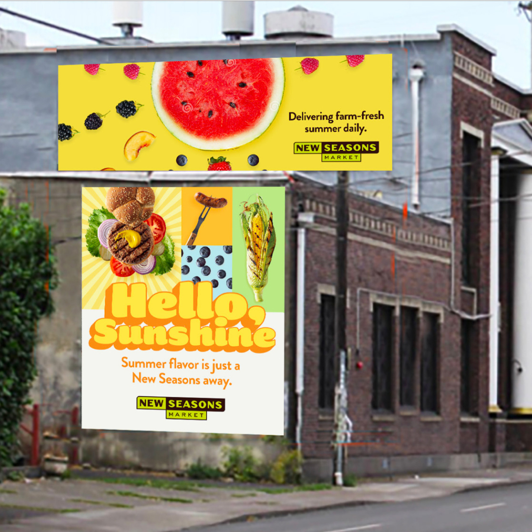
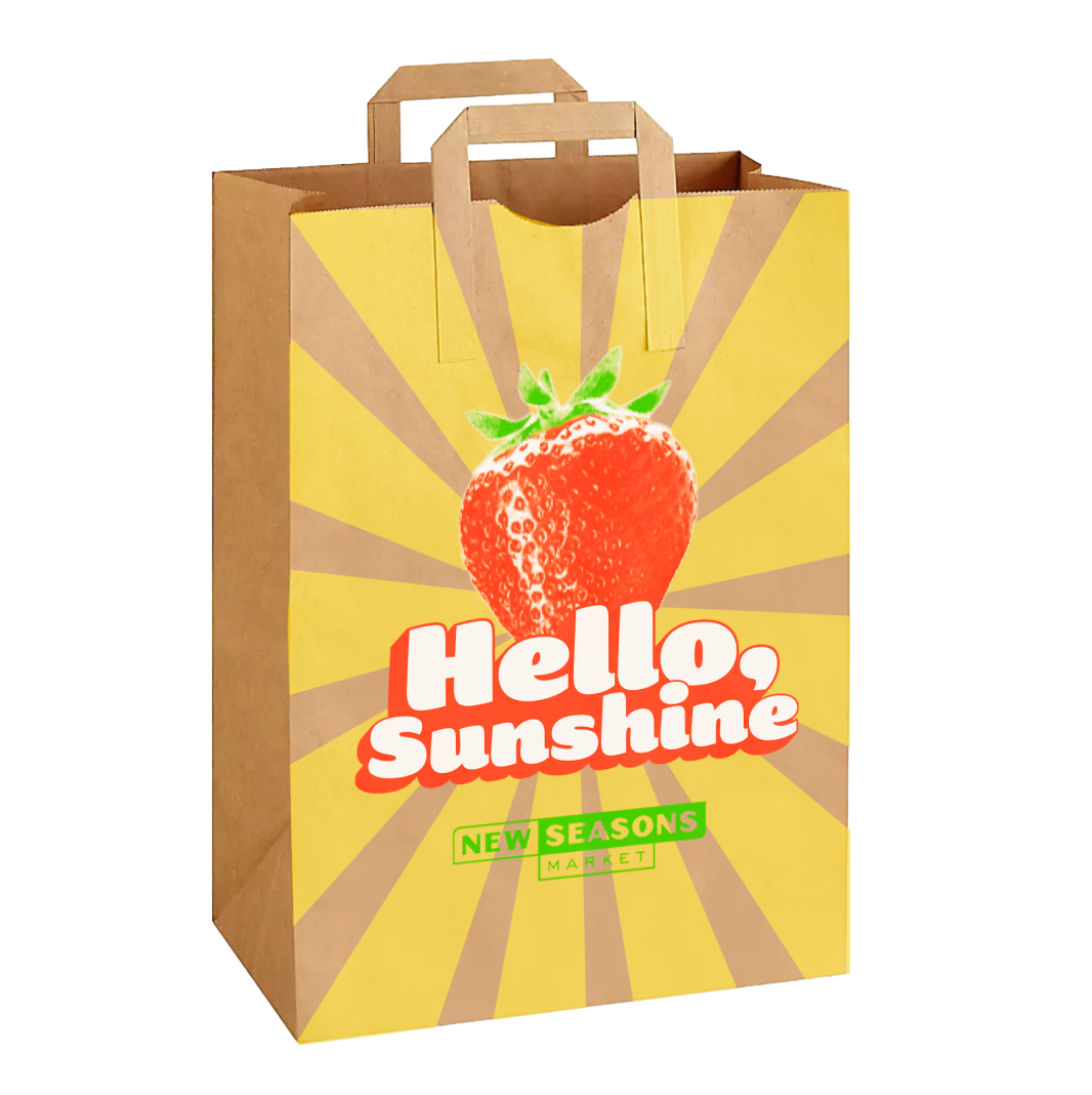
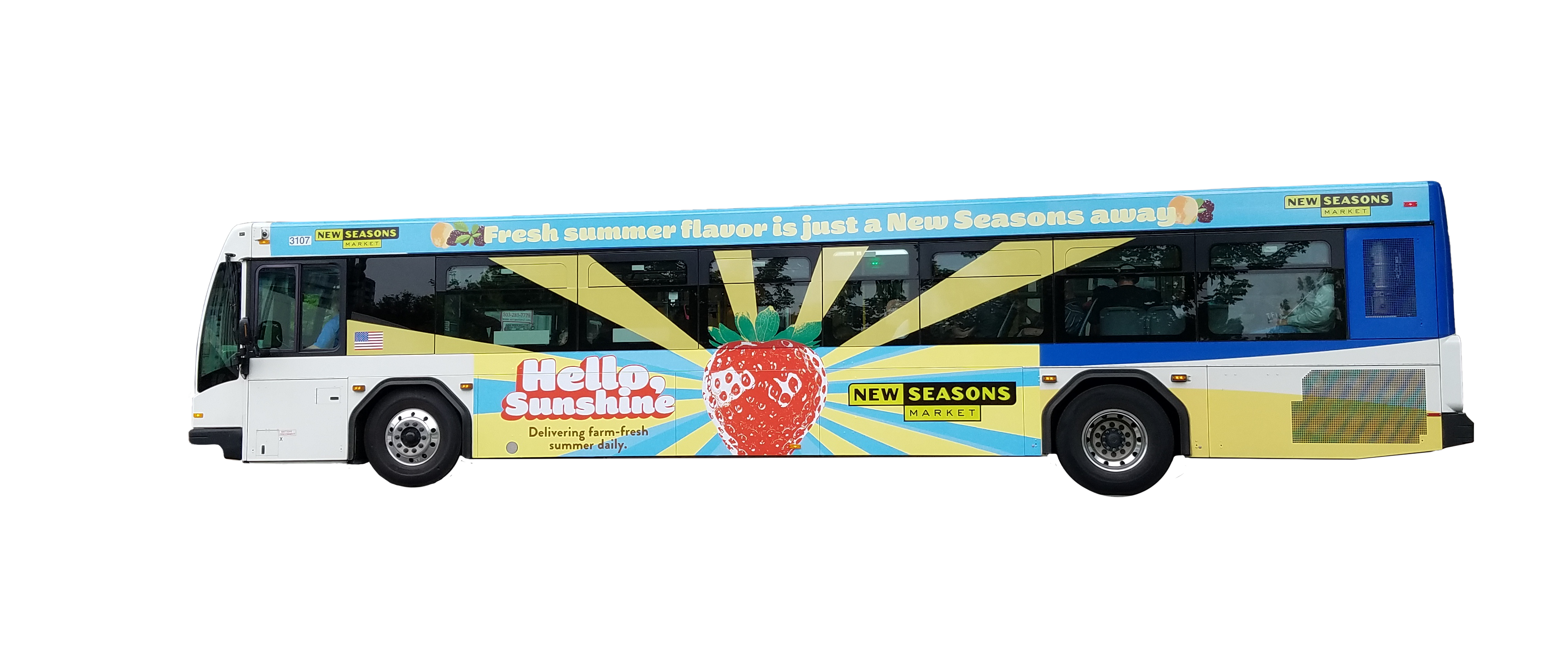
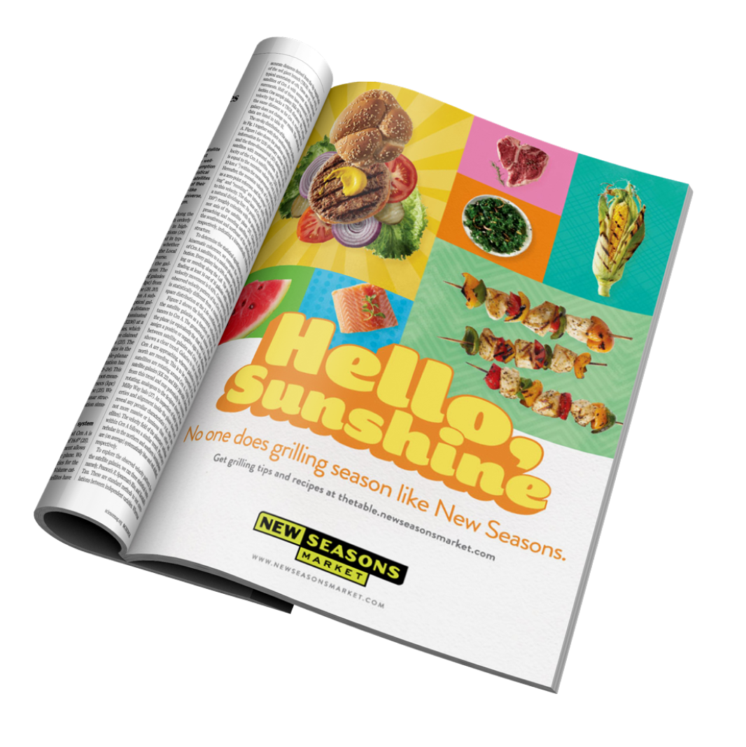
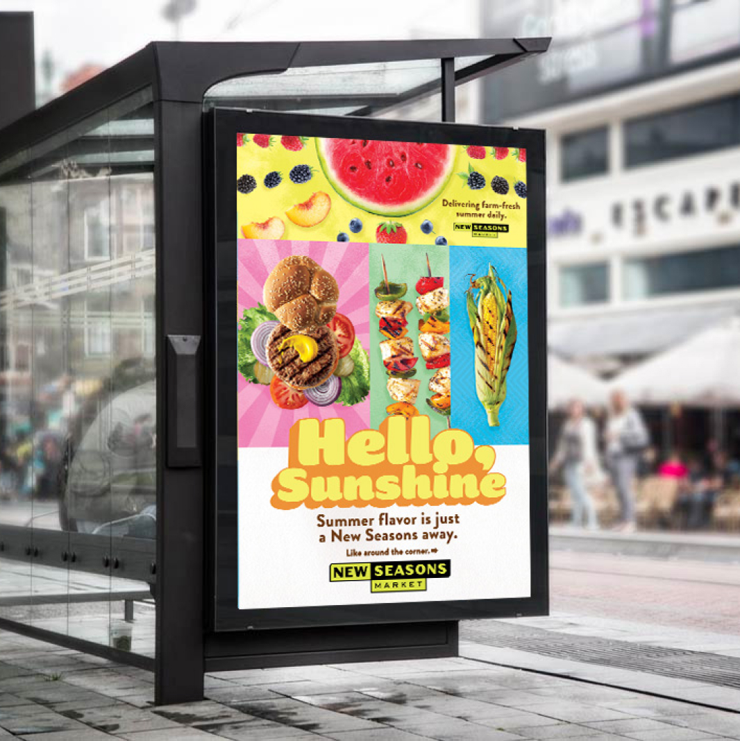
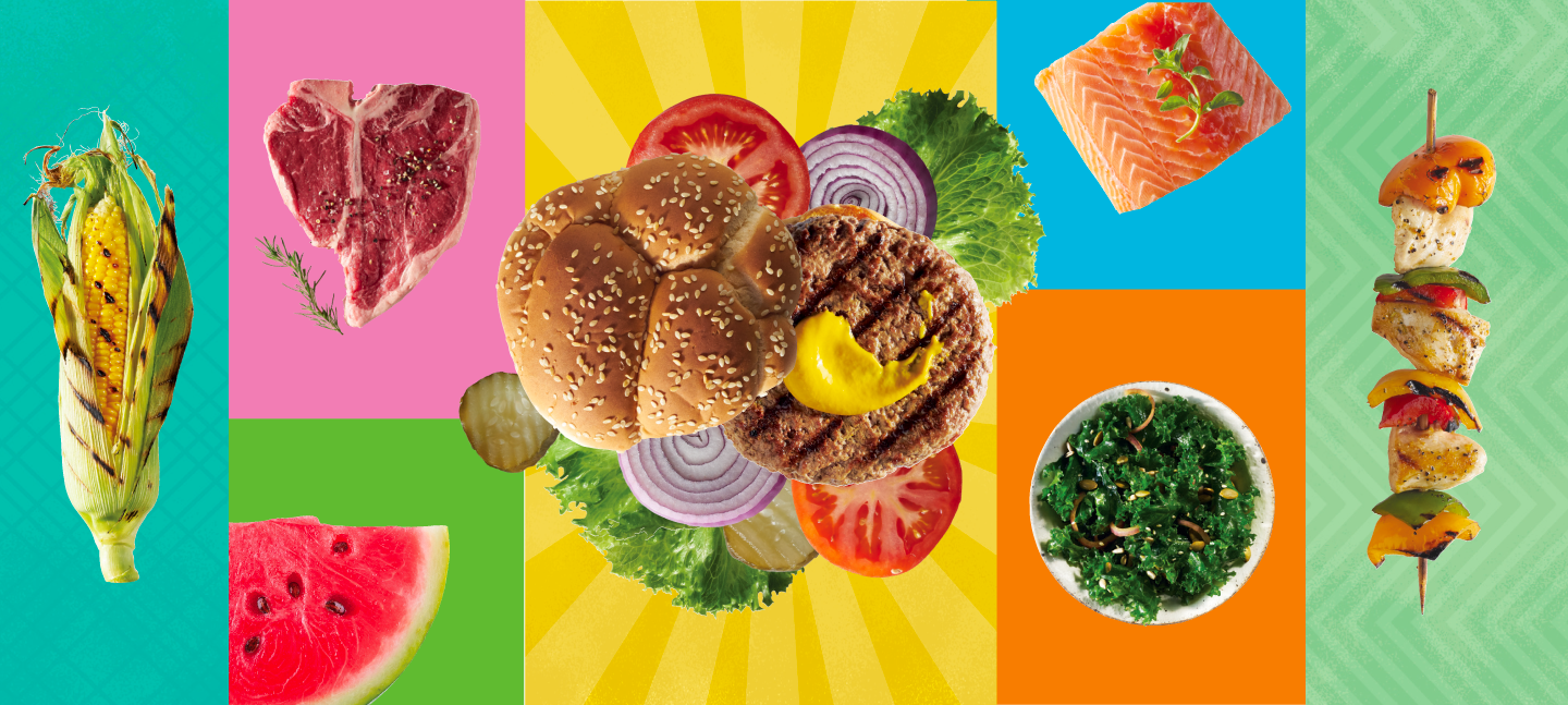
New Seasons Market | Hello, Summer Campaign
Endless Summer
Creative
Media
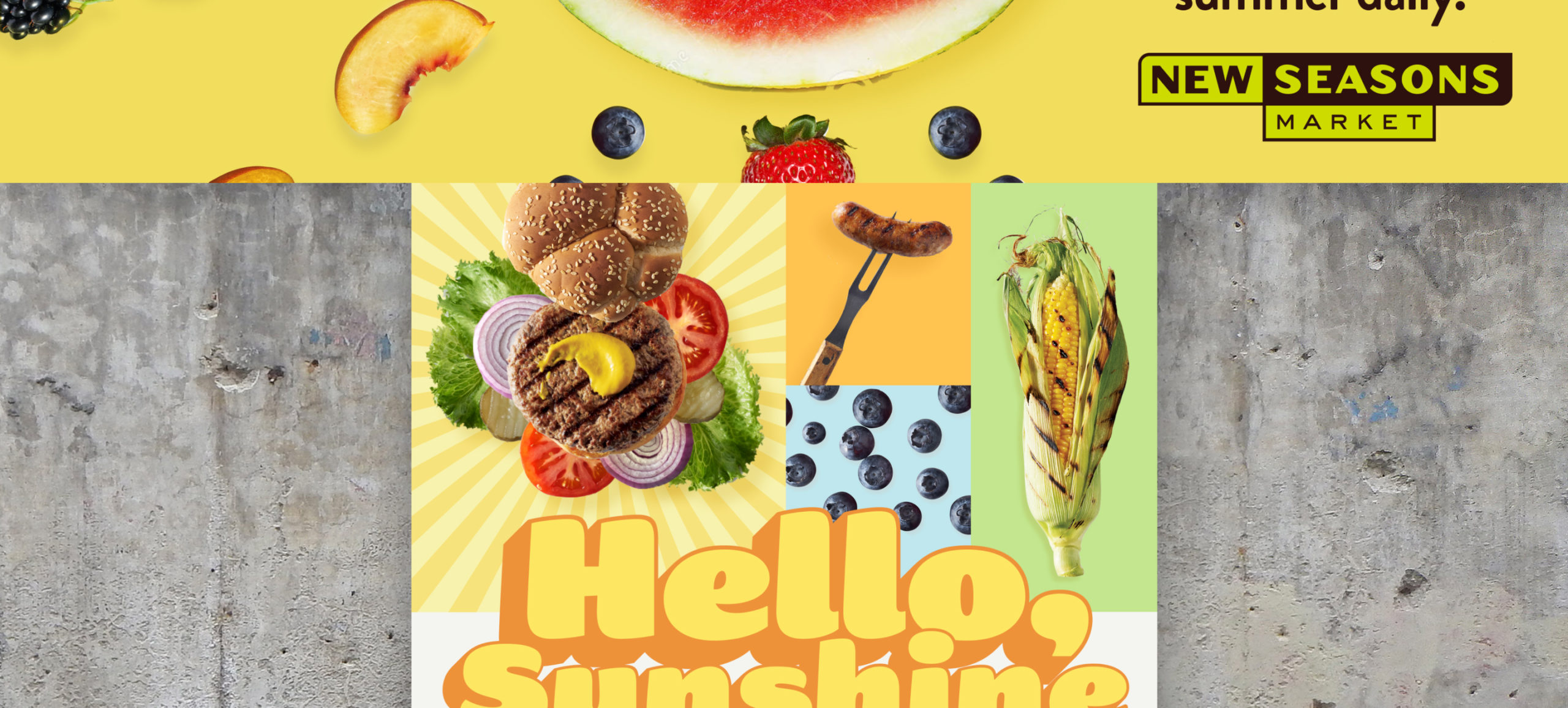
Portland’s cult-favorite grocery store, New Seasons Market, asked us to tackle their summer campaign, welcoming back the colorful bounty of deliciousness arriving alongside the warmer months. We developed a bright, attention-grabbing campaign across a host of print and digital media, highlighting the sheer joy of summer food.
If you live in the Pacific Northwest, you know: when the summer sun comes back, it feels like being reunited with a long lost friend. The central idea for this concept leaned into that welcoming feel with a warm, cheeky greeting set in a soft, sunshiney wordmark.
A moveable feast
Come late May, the Pacific Northwest is heavy with anticipation for the bright, distinctive flavor of summer cuisine. To capture the imagination, our creative let the food shine, using a library of high quality photography paired with vibrant colors and textures.
We focused our efforts on a cost-effective solution that effectively engaged targets, with ongoing optimization throughout the flight. The bright, attention-grabbing creative paired with out-of-home locations within spitting distance of a store made for a significant increase in foot traffic and sales.